XII
RHYTHM: UNITY OF LINE
リズム:線による統一
リズム:線による統一
12-1-1
Unity of line is a bigger quality than variety, and as it requires a larger mental grasp, is more rarely met with. The bigger things in drawing and design come under its consideration, including, as it does, the relation of the parts to the whole. Its proper consideration would take us into the whole field of Composition, a subject needing far more consideration [than it can be given][/than can be given to it/] in this book.
線による統一は、その変化よりも重要な特質である。より深い理解力が必要とされるので、目にすることは一層少ない。素描と構図のより大きな事柄が考慮の対象になり、実際には、部分の全体との関係を含む。きちんとこれを考えようとすると「絵画」というものの全領域に入り込むことになり、本書で扱える範囲を超える。
⚑ unity of line:「線の統一」? 「線による統一」?
⚑ design:「デザイン」でいいのでしょうか?
⚑ design:「デザイン」でいいのでしょうか?
⚑ including, as it does 分詞構文の強調、doesはincludingの代動詞と解釈して上記のように訳しました。
⚑ Composition:何故大文字で始まるのでしょう?
⚑ [/than can be given to it/]:第2版より訂正
12-2-1
In almost all compositions a rhythmic flow of lines can be traced. Not necessarily a flow of actual lines (although these often exist); they may be only imaginary lines linking up or massing certain parts, and bringing them into conformity with the rhythmic conception of the whole. Or again, only a certain stress and flow in the forms, suggesting line movements. But these line movements flowing through your panel are of the utmost importance; they are like the melodies and subjects of a musical symphony, weaving through and linking up the whole composition.
殆ど全ての絵画に、リズミカルな線の流れをたどることができる。必ずしも実際の線の流れとは限らない(実際の線であることが多いが)。単なる想像上の線で、いくつかの部分を結びつけて纏め、それを全体のリズムの構想に調和させたものもある。さらに言うと、単なる形の中の強勢や流れで、線の動きを暗示するだけのものもある。しかし、描く時に作品の中を流れるこれらの線の動きは極めて重要である。交響曲の旋律や主題のように、絵画全体を縫うように進み、つなげるのである。
⚑ compositions:「構図」?「作品(絵画)」?
⚑ panel:パネル 制作に使う画面といった意味で、その枠の意識があると思う。
⚑ panel:パネル 制作に使う画面といった意味で、その枠の意識があると思う。
12-3-1
Often, the line of a contour at one part of a picture is picked up again by the contour of some object at another part of the composition, and although no actual line connects them, a unity is thus set up between them. (See diagrams, pages 166 and 168, illustrating line compositions of pictures {145} by Botticelli and Paolo Veronese). This imaginary following through of contours across spaces in a composition should always be looked out for and sought after, as nothing serves to unite a picture like this relationship of remote parts. The flow of these lines will depend on the nature of the subject: they will be more gracious and easy, or more vigorous and powerful, according to the demands of your subject.
絵のある部分の輪郭線がその絵の他の部分に描かれたものの輪郭によって再び取り上げられることがよくある。実際の線が結びついてないにもかかわるず、こうしてそこに統一が生まれる。(166頁と168頁の図を参照のこと。ボッティチェリとパオロ・ヴェロネーゼの絵の線による構図を示す)。作品中に空間をまたいで想像上伸ばされた輪郭をいつも注意して探し求めるとよい。離れた部分のこうした関係のように絵を統一するものは、他にはないからである。この線の流れは対象の性質によって決まるだろう。描いていいるものによって、あるいはゆったり穏やかになり、あるいは勢いがあって力強くなる。
⚑ following through:「最後までやり遂げること」?「フォロースルーすること」?
⛾ Paolo Veronese:ヴェロネーゼ Paolo ~ (1528‐88) 《イタリア,ヴェネツィア派の画家;本名 Paolo Caliari》『リーダーズ』
12-4-1
⛾ Paolo Veronese:ヴェロネーゼ Paolo ~ (1528‐88) 《イタリア,ヴェネツィア派の画家;本名 Paolo Caliari》『リーダーズ』
12-4-1
This linking up of the contours applies equally well to the drawing of a single figure or even a head or hand, and the student should always be on the look out for this uniting quality. It is a quality of great importance in giving unity to a composition.
この輪郭同士の結びつきは、一人の人物を描く時も、あるいは手や頭部を単独で描く時であっても同様によく当てはまる。この統一をつくりだすところに、学生は常に注意を向けること。作品に統一感を与えるうえできわめて重要なものである。
12-5-1
Parallelism
When groups of lines in a picture occur parallel to each other they produce an accentuation of the particular quality the line may contain, a sort of sustained effect, like a sustained chord on an organ, the effect of which is much bigger than that of the same chord struck staccato. This sustained quality has a wonderful influence in steadying and uniting your work.
並列の効果
絵の中で線が互いに並行に並んでグループになっていると、線に備わる特定の性質が強調される。一種の重層的な効果で、オルガンの重層的な和音のようなものである。同じ和音をスタッカートで弾くよりも効果が大きい。この重層の持つ性質は、作品を安定させ統一するうえで素晴らしい働きをする。
12-6-1
This parallelism can only be used successfully with the simplest lines, such as a straight line or a simple curve; it is never advisable except in decorative patterns to be used with complicated shapes. Blake is very fond of the sustained effect parallelism gives, and uses the repetition of curved and straight lines very often in his compositions. Note in Plate I of the Job series, page 146 [Transcribers Note: Plate XXXI], the use made of this sustaining quality in the parallelism of the sheep's backs in the background and the parallel upward flow of the lines of the figures.
この並列の効果がうまく働くのは、直線や簡単な曲線など最もシンプルな線を使ったときだけである。複雑なかたちで用いるのは、装飾模様以外には勧められない。ブレイクは並列がもたらす重層的効果をとても好み、作品中に直線や曲線の繰り返しをよく用いた。146頁、ヨブ記のシリーズ第Ⅰ図、背景の羊の背の並びと並行に上にのびる人物の線に重層の効果が使われていることに注目。
⛾ この章のブレイクの版画の図版は、初版では本書の図版番号にA,B,C,Dの記号を付けて示しているが、第二版以降は版画のオリジナルのシリーズ番号を用いている。
12-6-2
In Plate II you see it used in the curved lines of the figures on either side of [146] the throne above, and in the two angels with the scroll at the left-hand corner. Behind these two figures you again have its use accentuating by repetition the peaceful line of the [hacks] [/backs/] of the sheep. The same thing can be seen in Plate [XXXI, B,] [/IV/] where the parallelism of the back lines of the sheep and the legs of the seated figures gives a look of peace contrasting with the violence of the messenger come to tell of the destruction of Job's sons.
第Ⅱ図では、上部の玉座両脇の人物の曲線と、左手隅の名簿を手にした二人の天使に見られる。二人の姿の後ろでは、穏やかな背の線が繰り返しによって強調されている。同じものが第Ⅳ図にもある。羊たちの背の線と座った人物の脚の線の並びがヨブの息子の破滅を告げにきた使者の荒々しさと対照されて平穏な様子を見せている。
⚑ [hacks] [/backs/]:デジタル化の際の誤り
⚑ [XXXI, B,] [/IV/]: 第二版より
13-6-3
The emphasis that parallelism gives to the music of particular lines is well illustrated in all Blake's work. He is a mine of information on the subject of line rhythm. Compare [A] [/I/] with Plate [XXXI, C] [/XXI/] ; note how the emotional quality is dependent in both cases on the parallelism of the upward flow of the lines. How also in Plate I he has carried the vertical feeling even into the sheep in the front, introducing little bands of vertical shading to carry through the vertical lines made by the kneeling figures.
並列の効果が特定の線によって作られる音楽を強調するのがブレイクのどの作品を見てもよく分かる。彼の作品は線のリズムに関する情報の宝庫である。第Ⅰ図を第XXI図と比べよう。両者を見て、上方へと流れる線の並びを使ってどのように情動を表現しているのか注意のこと。第Ⅰ図ではさらに、前方の羊にも垂直の感じを出している。垂直の陰影のわずかな筋を使って跪く人物がつくる垂直線へとつなげている。
⚑ He is a mine of information:「宝庫」のすわりをよくするため、内容は変わらないと思うので。he を「彼の作品」と意訳しました。
12-6-4
And in the last plate, "So the Lord blessed the latter end of Job more than the beginning," note how the greater completeness with which the parallelism has been carried out has given a much greater emphasis to the effect, expressing a greater exaltation and peace than in Plate [XXXI, A] [/I/]. Notice in Plate [XXXI, D] [/X/], where "The just, upright man is laughed to scorn," how this power of emphasis is used to increase the look of scorn hurled at Job by the pointing fingers of his three friends.
そしてシリーズ最後の図版「主はヨブの終りを初めよりも多く恵まれた」において、並列をより徹底して用いることで、図Iと比べて効果をさらに強くし、より大きな高揚感と平安を表現しているところに注目すること。 第X図は、「正しく全き人は物笑いとなる」の場面だが、ヨブに投げつけられる嘲笑の様子を強めるために、三人の友人が指さすことで、どのようにこの強調の効果が使われているのかよく見るように。
⛾ 図版番号は第二版以降訂正されました。初版では、本書の図版番号XXXI、XXXIIそれぞれ四つの図版にA,B,...Hの記号を付けて示していました。第二版以降はシリーズの連番で示しています。
⚑ [XXXI, A] [/I/]:第二版より
⚑ [XXXI, D] [/X/]:第二版より
12-7-1
Of the use of this principle in curved forms, the repetition of the line of the back in stooping figures is a favourite device with Blake. There will be found instances of this in [Plate XXXII, E and G] [/Plates II and XVIII]. (Further instances will be found on reference {147} to Plates VII, VIII, XIII, and [XVII] [/XVIII/], in Blake's Job.) In the last instance it is interesting to note how he has balanced the composition, which has three figures kneeling on the right and only one on the left. By losing the outline of the third figure on the right and getting a double line out of the single figure on the left by means of the outline of the mass of hair, and also by shading this single figure more strongly, he has contrived to keep a perfect balance. The head of Job is also turned to the left, while he stands slightly on that side, still further balancing the three figures on the right. (This does not show so well in the illustration here reproduced as in the original print.)
この方法の曲線形での使用で言えば、屈んだ人物の背中の線を繰り返すのがブレイクのお気に入りの表現法である。第Ⅱ図と第XVIII図にこの例が見られるだろう。(それ以外の例はブレイクのヨブ記第VII、 VIII、 XIII、XVIIIを参照。)最後の例では、彼がどのように構図のバランスをとっているのかを見ると興味深い。右に三人の人物が跪いている。左手は一人だけだ。右の三番目の人物の輪郭をなくし、左手の一人の人物から髪のマッスの輪郭を使って二重の線を取り出す。さらに、この人物の陰影をより強くすることで、完璧なバランスを保っている。ヨブの頭も左を向き、わずかに同じ方にずれて立っている。こうしてさらに、右の3人の人物とのバランスを作り出している。(ここに掲載した図版では原画ほどはっきりとはしていない。)
⚑ 第二版以降この図版番号はXVIIからXVIIIに訂正されているが、ここは初版のXVIIが正しいと思われる。文中the last instance はその前文( )の前の XVIII を指す。
⚑ [Plate XXXII, E and G] [/Plates II and XVIII]:第二版より
⚑ [XVII] [/XVIII/]:第二版より
⚑ [Plate XXXII, E and G] [/Plates II and XVIII]:第二版より
⚑ [XVII] [/XVIII/]:第二版より

図版 XXXI.
左上 (Plate I, Blake's Job) (ブレイクの『ヨブ記』第Ⅰ図)
Thus did Job continually.
ヨブはいつも、このように行った。1:5
右上 (Plate IV, Blake's Job) (ブレイクの『ヨブ記』第IV図)
And I only am escaped alone to tell thee.
わたしはただひとりのがれて、あなたに告げるために来ました。1:19
左下 (Plate XXI, Blake's Job) (ブレイクの『ヨブ記』第XXI図)
So the Lord blessed the latter end of Job more than the beginning.
主はヨブの終りを初めよりも多く恵まれた。42:12
右下 (Plate X, Blake's Job) (ブレイクの『ヨブ記』第X図)
The just upright man is laughed to scorn.
正しく全き人は物笑いとなる。12:4
⛾ 上の聖書の訳は、口語訳聖書1955年版より。参考に訳の後に章・節番号を入れました。
参考として著者が示した図は以下のものです。(三重県立美術館のサイトより)
 |
| ブレイク『ヨブ記』第Ⅶ図 |
 |
| ブレイク『ヨブ記』第Ⅷ図 |
 |
| ブレイク『ヨブ記』第ⅩⅢ図 |
 | |
| ブレイク『ヨブ記』第ⅩⅦ図 |
12-8-1
Some rude things were said above about the straight line and the circle, on account of their lack of variety, and it is true that a mathematically straight line, or a mathematically perfect circle, are never found in good artistic drawing. For without variety is no charm or life. But these lines possess other qualities, due to their maximum amount of unity, that give them great power in a composition; and where the expression of sublimity or any of the deeper and more profound sentiments are in evidence, they are often to be found.
前に直線と円について変化がないということでいささかぞんざいなことを話したが、数学的に真直ぐな線と数学的に完全な円は、優れた芸術的素描には決して見られないというのも事実である。変化がなければ魅力も活力もないからである。しかし、この線には別の長所がある。この上ない統一感があり、これが作品に大きな力を与えるのである。それは、崇高の表現あるいはより深く根源的な感情が感じられるところによく見られる。
12-9-1
The rows of columns in a Greek temple, the clusters of vertical lines in a Gothic cathedral interior, are instances of the sublimity and power they possess. The necessary play that makes for vitality—the "dither" as we called this quality in a former chapter—is given in the case of the Greek temple by the subtle curving of the lines of columns and steps, and by the rich variety of the sculpture, and in the case of the Gothic cathedral by a rougher cutting of the stone blocks and the variety in the {148} colour of the stone.
ギリシャの寺院の列柱やゴシック大聖堂内部装飾の連続する垂直線は、直線の持つ崇高と力の例である。前の章で「ディザー」と呼んだ、活力を作り出すのに必要な遊びは、ギリシャの寺院では列柱と階段の線の微妙なカーブと彫刻の豊富な変化によって、ゴシック大聖堂の場合は石材の粗めの仕上げや石の色に見られる変化によって生みだされる。
12-9-2
But generally speaking, in Gothic architecture this particular quality of "dither" or the play of life in all the parts is conspicuous, the balance being on the side of variety rather than unity. The individual workman was given a large amount of freedom and allowed to exercise his personal fancy. The capitals of columns, the cusping of windows, and the ornaments were seldom repeated, but varied according to the taste of the craftsman. Very high finish was seldom attempted, the marks of the chisel often being left showing in the stonework. All this gave a warmth and exuberance of life to a fine Gothic building that makes a classical building look cold by comparison. The freedom with which new parts were built on to a Gothic building is another proof of the fact that it is not in the conception of the unity of the whole that their chief charm consists.
しかし一般的に言えば、ゴシック建築では、「ディザー」という特性、つまり生命の遊びがあらゆる部分で目につく。統一よりむしろ変化の方にバランスが傾いているのだ。職人は大きな自由が与えられていて、個々の想像力を発揮できたのである。柱の頭部、窓の茨や装飾が同じもので繰り返されることはめったになく、職人の好みによって変化に富んでいた。高度の仕上げがなされたのは稀であり、のみの跡はのこされて石細工に見えている。これら全てが生命の温もりと充溢を見事なゴシック建築に与えていて、これに比較すると古典様式の建物は冷たく見える。新しいパーツがゴシック建築に自由に付け加えられていったことは、ゴシック建築の主な魅力は全体の統一にはないということのもう一つの証となっている。
12-10-1
On the other hand, a fine classic building is the result of one large conception to which every part has rigorously to conform. Any addition to this in after years is usually disastrous. A high finish is always attempted, no tool marks nor any individuality of the craftsman is allowed to mar the perfect symmetry of the whole. It may be colder, but how perfect in sublimity! The balance here is on the side of unity rather than variety.
一方、卓越した古典主義建築は一つの大きな構想によって作られる。あらゆる部分はそれに厳格に従わねばならない。後年、これに何であれ付け加えると大抵悲惨な結果になる。常に高度に仕上げられ、工具の跡や職人の個性によって全体の完全な対称性を損なうようなことはあってはならない。冷たく感じるかもしれないが、なんと完璧な崇高感であることか。ここではバランスは変化よりも統一にある。
12-11-1
The strength and sublimity of Norman architecture is due to the use of circular curves in the arches, combined with straight lines and the use of square forms in the ornaments—lines possessed of least variety.
ノルマン式建築の力強さと荘厳さは、アーチ部に直線と組み合わせて円曲線を使用し、装飾に方形を使っていることから生まれる。変化というものが殆ど見られない線である。
⛾ Norman architecture:ノルマン建築《10 世紀半ばごろ Normandy 地方に現われ,ノルマン人の征服後 12 世紀までイングランドで盛んに行なわれたロマネスク風の建築用式;半円アーチ・太い柱などを特色とした》;ノルマン風の建築.『リーダーズ英和辞典』
12-12-1
All objects with which one associates the look of strength will be found to have straight lines in their composition. The look of strength in a strong {149} man is due to the square lines of the contours, so different from the rounded forms of a fat man. And everyone knows the look of mental power a square forehead gives to a head and the look of physical power expressed by a square jaw. The look of power in a rocky landscape or range of hills is due to the same cause.
力強く見える対象は皆、その構造に直線があることがわかるだろう。強健な男が強く見えるのは輪郭の四角い線のためである。太った男の丸い形とはだいぶ違う。誰しも知っているように、四角い額によって精神力のある外観が頭部に生まれ、角張った顎によって肉体的力があるように見える。岩だらけの風景や山並みが力強く見えるのは同じ理由である。

Plate XXXII.
図版 XXXII.
左上 (Plate II, Blake's Job) (ブレイクの『ヨブ記』第Ⅱ図)
When the Almighty was yet with me, when my children were about me.
あの時には、全能者がなおわたしと共にいまし、わたしの子供たちもわたしの周囲にいた。29:5
右上 (Plate XI, Blake's Job) (ブレイクの『ヨブ記』第XI図)
With dreams upon my bed Thou scarest me, and affrightest me with visions.
あなたは夢をもってわたしを驚かし、幻をもってわたしを恐れさせられる。7:14
Printed [the wrong way] [/sideways/] up in order to show that the look of horror is not solely dependent on the things represented but belongs to the rhythm, the pattern of the composition.
間違った方を上にして印刷してある。恐ろしく見えるのは表現された物のためだけでなく、リズム、つまり構図のパターンの結果だということを示すためである。
⛾ 第二版まで[the wrong way]となっている。左下 (Plate XVIII, Blake's Job) (ブレイクの『ヨブ記』第XVIII図)
And my servant Job shall pray for you.
わたしのしもべヨブはあなたがたのために祈るであろう42:8
When the morning-stars sang together, and all the sons of God shouted for joy.
かの時には明けの星は相共に歌い、神の子たちはみな喜び呼ばわった38:7
The Horizontal and the Vertical
水平と垂直
12-13-1
The horizontal and the vertical are two very important lines, the horizontal being associated with calm and contemplation and the vertical with a feeling of elevation. As was said above, their relation to the sides of the composition to which they are parallel in rectangular pictures is of great importance in uniting the subject to its bounding lines and giving it a well-knit look, conveying a feeling of great stability to a picture.
水平線と垂直線は二つの重要な線である。水平線は静けさや瞑想に結びついている。垂直線は高揚感に関係している。前に述べたように、それらの線と作品の辺との関係は、四角い絵では平行になるので、対象を境界線と結びつけて整然とした印象を作り、絵に安定感を与えるうえできわめて大切である。
12-14-1
How impressive and suggestive of contemplation is the long line of the horizon on a calm day at sea, or the [long, horizontal] [/long horizon/] line of a desert plain! The lack of variety, with all the energy and vitality that accompany it, gives one a sense of peace and rest, a touch of infinity that no other lines can convey. The horizontal lines which the breeze makes on still water, and which the sky often assumes at sunset, affect us from the same harmonic cause.
穏やかな日に海岸に立って長く続く水平線を見ていると、なんとも感動的で、瞑想へと誘われる。砂漠のどこまでも続く地平線も同じである。変化のないこと、それに付随する活力もない状況は、人に安らぎの感覚、永遠に触れる感覚、を与える。他の線では伝えることのできない感覚である。静かな水面に微風が描く幾筋もの水平な線、夕焼けの空が見せる水平な線も同じ調和の働きで我々を感動させる。
⚑ a touch of:「僅かな」「ちょっとした」?
⚑ [long, horizontal] [/long horizon/]:第二版より
12-15-1
The stone pine and the cypress are typical instances of the sublime associated with the vertical in nature. Even a factory chimney rising above a distant town, in spite of its unpleasant associations, is impressive, not to speak of the beautiful spires of some of our Gothic cathedrals, pointing upwards. How well Constable has used the vertical sublimity of the spire of Salisbury Cathedral can be seen in his picture, at the Victoria and Albert Museum, where he has contrasted it with the gay tracery of an arch {150} of elm trees. Gothic cathedrals generally depend much on this vertical feeling of line for their impressiveness.
カサマツやイトスギは、自然界において垂直線が醸し出す崇高さの典型例である。遠くの町の上に見える工場の煙突でさえ、不快な連想を呼び起こしはするが、強い印象を与える。我が国のゴシックの大聖堂のいくつかに見られる高くそびたつ美しい尖塔は言うまでもない。コンスタブルは、尖塔の垂直が作る崇高さを作品に見事に活かした。ヴィクトリア・アンド・アルバート博物館所蔵の絵では、ソールズベリー大聖堂の尖頭と楡の木がつくるアーチの華やいだ狭間飾りとを対比させて描いている。ゴシックの大聖堂は、一般的に、その荘厳さについて垂直線が作るこの感情に負うところが大きい。
⛾ コンスタブル:John ~ (1776‐1837) 英国の風景画家 ターナーとほぼ同世代
⛾ ソールズベリー大聖堂:ソールズベリー大聖堂 イングランド Salisbury にある大聖堂。英国ゴシック大聖堂で最も統一のとれたものとされる。『リーダーズ・プラス』より
⛾ ヴィクトリア・アンド・アルバート博物館:London の South Kensington の Exhibition Roadにある国立の美術・芸術博物館; 図書館機能も充実『リーダーズ・プラス』より
 |
| 『主教の庭から見たソールズベリー大聖堂』コンスタブル(Wikipediaより) |
12-16-1
The Romans knew the expressive power of the vertical when they set up a lonely column as a monument to some great deed or person. And a sense of this sublimity may be an unconscious explanation of the craze for putting towers and obelisks on high places that one comes across in different parts of the country, usually called someone's "folly."
ローマ人は垂直線に荘厳な力があるのを知っていて、偉人や偉業の記念碑として、ぽつんと聳える記念柱を建立した。国の様々な場所で出くわし、たいてい誰それの「愚行」と呼ばれているような塔やオベリスクを高い所に建てたがるのは、この崇高の感覚の無意識の現れなのかもしれない。
⚑ that:先行詞は? towers and obelisksか? high placesか?
⚑ the country:「国・国土」か? 「田園・郊外」か?
12-17-1
In the accompanying diagrams, A, B, C and D, E, F, pages 152 [Transcribers Note: Diagram X] and 153 [Transcribers Note: Diagram XI], are examples of the influence to be associated with the horizontal and vertical lines. A is nothing but six straight lines drawn across a rectangular shape, and yet I think they convey something of the contemplative and peaceful sense given by a sunset over the sea on a calm evening. And this is entirely due to the expressive power straight lines possess, and the feelings they have the power to call up in the mind.
152、153頁に添付した図A、B、C と D、E、Fは、水平線と垂直線に関係づけられる作用を例示している。Aは、長方形を横切って引かれた6本の直線にすぎないが、それでも何か、静かな夕映えの海が与える瞑想に誘うような感じと安らぎを伝えていると思う。これはもっぱら直線に備わる表現力によるものであり、 それが心中に喚起する感情によって生まれているのである。
12-17-2
In B a little more incident and variety has been introduced, and although there is a certain loss of calm, it is not yet enough to destroy the impression. The line suggesting a figure is vertical and so plays up to the same calm feeling as the horizontal lines. The circular disc of the sun has the same static quality, being the curve most devoid of variety. It is the lines of the clouds that give some excitement, but they are only enough to suggest the dying energy of departing day.
Bでは、出来事と変化が幾らか導入される。穏やかさがある程度なくなるが、まだ印象を壊す程ではない。人物を思わせる線が垂直であり、水平線と同様の落ち着いた感じを作り出す。太陽の丸は、変化の最も乏しい曲線なので、おなじく静的な性質がある。いくらかときめきを生んでいるのは雲の線であるが、これも去り行く日の消えかかる活力をやっと示す程度である。
⚑ plays up to :助演する
⚑ departing day:夕暮れ
12-18-1
Now let us but bend the figure in a slight curve, as at C, and destroy its vertical direction, partly cover the disc of the sun so as to destroy the complete circle, and all this is immediately altered, our {151} calm evening has become a windy one, our lines now being expressive of some energy.
ここでCのように人物を少し曲げて垂直の方向感をなくし、太陽の丸を部分的に覆い完全な円を壊してみよう。これだけのことだが急に変わると、先ほどまでの穏やかな夕暮れは風が強くなり、線は今や活力を表現するものとなる。

12-19-1
To take a similar instance with vertical lines. Let D represent a row of pine trees in a wide plain. Such lines convey a sense of exaltation and infinite calm. Now if some foliage is introduced, as at E, giving a swinging line, and if this swinging line is carried on by a corresponding one in the sky, we have introduced some life and variety. If we entirely destroy the vertical feeling and bend our trees, as at F, the expression of much energy will be the result, and a feeling of the stress and struggle of the elements introduced where there was perfect calm.
ローマ人は垂直線に荘厳な力があるのを知っていて、偉人や偉業の記念碑として、ぽつんと聳える記念柱を建立した。国の様々な場所で出くわし、たいてい誰それの「愚行」と呼ばれているような塔やオベリスクを高い所に建てたがるのは、この崇高の感覚の無意識の現れなのかもしれない。
⚑ that:先行詞は? towers and obelisksか? high placesか?
⚑ the country:「国・国土」か? 「田園・郊外」か?
12-17-1
In the accompanying diagrams, A, B, C and D, E, F, pages 152 [Transcribers Note: Diagram X] and 153 [Transcribers Note: Diagram XI], are examples of the influence to be associated with the horizontal and vertical lines. A is nothing but six straight lines drawn across a rectangular shape, and yet I think they convey something of the contemplative and peaceful sense given by a sunset over the sea on a calm evening. And this is entirely due to the expressive power straight lines possess, and the feelings they have the power to call up in the mind.
152、153頁に添付した図A、B、C と D、E、Fは、水平線と垂直線に関係づけられる作用を例示している。Aは、長方形を横切って引かれた6本の直線にすぎないが、それでも何か、静かな夕映えの海が与える瞑想に誘うような感じと安らぎを伝えていると思う。これはもっぱら直線に備わる表現力によるものであり、 それが心中に喚起する感情によって生まれているのである。
12-17-2
In B a little more incident and variety has been introduced, and although there is a certain loss of calm, it is not yet enough to destroy the impression. The line suggesting a figure is vertical and so plays up to the same calm feeling as the horizontal lines. The circular disc of the sun has the same static quality, being the curve most devoid of variety. It is the lines of the clouds that give some excitement, but they are only enough to suggest the dying energy of departing day.
Bでは、出来事と変化が幾らか導入される。穏やかさがある程度なくなるが、まだ印象を壊す程ではない。人物を思わせる線が垂直であり、水平線と同様の落ち着いた感じを作り出す。太陽の丸は、変化の最も乏しい曲線なので、おなじく静的な性質がある。いくらかときめきを生んでいるのは雲の線であるが、これも去り行く日の消えかかる活力をやっと示す程度である。
⚑ plays up to :助演する
⚑ departing day:夕暮れ
12-18-1
Now let us but bend the figure in a slight curve, as at C, and destroy its vertical direction, partly cover the disc of the sun so as to destroy the complete circle, and all this is immediately altered, our {151} calm evening has become a windy one, our lines now being expressive of some energy.
ここでCのように人物を少し曲げて垂直の方向感をなくし、太陽の丸を部分的に覆い完全な円を壊してみよう。これだけのことだが急に変わると、先ほどまでの穏やかな夕暮れは風が強くなり、線は今や活力を表現するものとなる。

Photo Mansell & Co.
PLATE XXXIII.
FÊTE CHAMPÊTRE. GIORGIONI (LOUVRE)
Note the straight line introduced in seated female figure with flute to counteract rich forms.
図版 XXXIII.
野外の祭り ジョルジョーネ(ルーブル)
フルートを持って座っている女性の体に直線が用いられ、豊満な形を中和していることに注目のこと。
⛾ 上の絵は邦題は一般に『田園の合奏』。現在はティツィアーノの作品と考えられているそうです。
⛾ ジョルジョーネ Giorgione da Castelfranco,Giorgio Barbarelli (1478?-1511):イタリアのベネチア派の画家.『ランダムハウス』
⛾ ティツィアーノ:Tiziano Vecellio(1490頃~1576):イタリアのベネチア派の画家
⛾ ティツィアーノ:Tiziano Vecellio(1490頃~1576):イタリアのベネチア派の画家
To take a similar instance with vertical lines. Let D represent a row of pine trees in a wide plain. Such lines convey a sense of exaltation and infinite calm. Now if some foliage is introduced, as at E, giving a swinging line, and if this swinging line is carried on by a corresponding one in the sky, we have introduced some life and variety. If we entirely destroy the vertical feeling and bend our trees, as at F, the expression of much energy will be the result, and a feeling of the stress and struggle of the elements introduced where there was perfect calm.
同じような例を垂直線の場合で挙げる。Dは広い平原に立つ松並木を表すものとしよう。そのような線は高揚と永遠の静けさを感じさせる。ここで、Eのように、葉を描き加えると、揺れ動くような線ができる。この揺れ動くような線に対応するように空に線が加わると、生命感と変化が生じる。Fのように、垂直の感じを全く失わせ、描いた木々を曲げれば、大きな活力が表現されることになるだろう。全く静かだったところに、自然がもたらす緊張と葛藤の感情が生まれる。
⚑ swinging line
⚑ carried on :使用例̻̻◆carry on many improvements多くの改善を加える◆Today much business is carried on by telephone today.今日では多くの商いが電話で行われている.『ランダムハウス』
⚑ a feeling of the stress and struggle of the elements:a feeling of (the stress and struggle) of the elements か? element は(天候や大気の)自然力,作用;天気,空模様;(特に)悪天候『ランダムハウス』か?
⚑ a feeling of the stress and struggle of the elements:a feeling of (the stress and struggle) of the elements か? element は(天候や大気の)自然力,作用;天気,空模様;(特に)悪天候『ランダムハウス』か?
12-20-1
It is the aloofness of straight lines from all the fuss and flurry of variety that gives them this calm, infinite expression. And their value as a steadying influence among the more exuberant forms of a composition is very great. The Venetians knew this and made great use of straight lines among the richer forms they so delighted in.
直線にこの静穏ではかり知れない表現力があるのは、変化がもたらすあらゆる騒がしさや慌ただしさとは無縁であるからだ。作品中のもっと生き生きした形を安定させる力として、その価値はとても大きい。ベネチア派の画家たちはこのことを承知していて、彼らが好んだ豊満な形の中で直線を大いに活用した。
⚑ this calm, infinite expression:「,]だけで語を並列させることがあるのか?
12-21-1
It is interesting to note how Giorgione in his "Fête Champêtre" of the Louvre (see illustration, page 151 [Transcribers Note: Plate XXXIII]), went out of his way to get a straight line to steady his picture and contrast with the curves. Not wanting it in the landscape, he has boldly made the contour of the seated female [ ][/figure/] conform to a rigid straight line, accentuated still further by the flute in her hand. If it were not for this and other straight lines in the picture, and a certain squareness of drawing in the draperies, the richness of the trees in the background, the full forms of the flesh and drapery would be too much, and the effect become sickly, if not positively sweet.
ジョルジョーネがルーブルの彼の作品『野外の祭り』(151頁の図版参照)において、絵を安定させ、曲線とのコントラストをつけるため、どのように直線を意図的に用いているのか注意して見ると面白い。風景には直線を使いたくなかったので、腰かけた女性の姿の輪郭を大胆に固い直線に近づけ、さらに手にしているフルートでこれを強調した。仮に、絵にこの直線や他の直線がなく、さらに衣文がある程度四角く描写されていなければ、背景の樹木の繁茂や素肌と衣文の豊満な形は過剰となり、効果は、ひどく甘ったるいとまではいかなくとも、弱いものになるだろう。
⚑ certain:「ある程度」?
⚑ the effect become sickly, if not positively sweet 『ジーニアス英和大辞典』に「[A, if not B で][AとBは通例形容詞・副詞・名詞] Bと言っては言い過ぎだがAと言ってもさしつかえがない, Bでないにしても, Bとまではゆかなくても;Bと言ってよいほどにAである《◆A < B の関係にあり文法的に対等な品詞を用いる》」とあり、これにあてはめるとsickly <sweetとなる。意味としてはsickly >sweetだと思うのですが?
⚑ the seated female [ ][/figure/] 第二版より
12-21-2
Van Dyck, also, used to go out of his way to introduce a hard straight line near the head in his portraits for the same {154} reason, often ending abruptly, without any apparent reason, a dark background in a hard line, and showing a distant landscape beyond in order to get a light mass to accentuate the straight line.
ヴァン・ダイクもよく同じ理由から肖像の頭部の近くでことさらに固い直線を使った。明確な理由もなく、暗い背景を固い線で急に切り、その向こう側に遠景を見せ、明るいマッス(塊り)をつくって直線を強調した。
⛾ Van Dyck: Sir Anthony,バンダイク,ファンダイク(1599-1641):フランドルの画家;英国王 Charles I の首席宮廷画家(1632-41).『ランダムハウス』
⛾ Van Dyck: Sir Anthony,バンダイク,ファンダイク(1599-1641):フランドルの画家;英国王 Charles I の首席宮廷画家(1632-41).『ランダムハウス』
 |
| Nicholas Lanier 1628ヴァン・ダイク作(Wikipediaより) |
{152}

Diagram X.
ILLUSTRATING, A, CALM RHYTHMIC INFLUENCE OF HORIZONTAL LINES SUCH AS A SUNSET OVER THE SEA MIGHT GIVE; B, INTRODUCTION OF LINES CONVEYING SOME ENERGY; C, SHOWING DESTRUCTION OF REPOSE BY FURTHER CURVING OF LINES. THE CALM EVENING HAS BECOME A WINDY ONE.
図 X.
A、夕暮れの海で見られるような水平線の穏やかでリズミカルな力;B、活力を感じさせる線を加える;C、さらに線を曲げることで静けさを壊す。穏やかな夕暮れは風が強くなってしまった。
{153}
 Diagram XI.
ILLUSTRATING, D, RHYTHMIC INFLUENCE OF VERTICAL LINES; E, THE INTRODUCTION OF SOME VARIETY; F, THE DESTRUCTION OF THE VERTICAL AND CONSEQUENT LOSS OF REPOSE.


{153}

ILLUSTRATING, D, RHYTHMIC INFLUENCE OF VERTICAL LINES; E, THE INTRODUCTION OF SOME VARIETY; F, THE DESTRUCTION OF THE VERTICAL AND CONSEQUENT LOSS OF REPOSE.
図 XI.
D、垂直線のリズミカルな力;E、変化を加える;F、垂直を壊して静謐をなくす。
12-22-1
The rich modelling and swinging lines of the "Bacchus and Ariadne" of Titian in the National Gallery, [here reproduced, page 154 [Transcribers Note: Plate XXXIV]] [/reproduced on the opposite page,/], would be too gross, were it not for the steadying influence of the horizontal lines in the sky and the vertical lines of the tree-trunks.
向かいの頁に写真を掲載したナショナルギャラリーのティツィアーノの作品『バッカスとアリアドネ』に見られる豊かな肉付けと曲線は、もし空の水平線と切り株の垂直線がつくる安定感をもたらす力がなければ、余りにしつこいものになっていたであろう。
⚑ here reproduced, page 154:第二版以降は[/reproduced on the opposite page,/]
12-23-1
While speaking of this picture, it might not be out of place to mention an idea that occurred to me as to the reason for the somewhat aggressive standing leg of the female figure with the cymbals leading the procession of revellers. I will not attempt any analysis of this composition, which is ably gone into in another book of this series. But the standing leg of this figure, given such prominence in the composition, has always rather puzzled me.
この絵にふれた機会に、お祭り騒ぎの行列の先頭でシンバルを手にした女性のやや鮮烈なまっすぐに伸ばした脚の理由について私の考えを述べても場違いではないだろう。この作品について分析をしようというのではない。それは、この出版シリーズの別の本で適切に扱われる。しかし、この人物のまっすぐに伸びた脚は、作品のなかで重要であるにしても、私にはいささか不可解であった。
⚑ leg:「脚」としました。footを「足」とし、訳し分けました。
12-23-2
I knew Titian would not have given it that vigorous stand without a good reason. It certainly does not help the run of the composition, although it may be useful in steadying it, and it is not a particularly beautiful thing in itself, as the position is one better suited to a man's leg than to a woman's. But if you cover it over with your finger and look at the composition without it, I think the reason of its prominence becomes plainer.
ティツィアーノが理由もなくその脚を力強く見えるようにしたわけではないと思う。作品に落ち着きを与えはするが、動きを生み出す働きはないのは確かである。それ自体特に美しいものではない。女の脚よりも男の脚の方がぴったりくる位置である。しかし指でそれを覆って、それなしで構図を見てみると、それを目立たせた理由がはっきりとしてくると思う。
⚑ help the run of the composition:意味不明 run (ある物の)向き,方向(direction):
(事の)趨勢(すうせい),傾向;成り行き『ランダムハウス』
12-23-3
Titian evidently had some trouble, as well he might have, with the forward leg of the Bacchus. He wished to give the look of his stepping from the car lightly treading the air, as gods may be permitted to do. But the wheel of the car that comes behind the foot made it difficult to evade the idea that he was stepping on it, which would be the way an ordinary mortal {155} would alight. I think the duty of the aggressive standing leg of the leading Bacchante, with its great look of weight, is to give a look of lightness to this forward leg of Bacchus, by contrast—which it certainly does.
ティツィアーノは、無理からぬことではあるが、バッカスの手前の脚の描写に悩んでいたようだ。バッカスを、神ならばそうするように、車から軽やかに宙を歩んで降りるように見せたかったのだ。しかし、足の後ろに車輪がくるので、どうしても車輪に足をかけていたように思えてしまう。これでは普通の人間の降り方だ。先頭の巫女の鮮烈な真直ぐ伸びた脚の役割は、バッカスの手前の脚を対照的に軽やかに見せることにあると思う。確かにそうなっている。
⚑ as well he might have:as well he might(…したのは) 彼にとって無理もない 当然のこと『ロングマン』
12-23-4
On examining the picture closely in a good light, you will see that he has had the foot of Bacchus in several positions before he got it right. Another foot can distinctly be seen about a couple of inches or so above the present one. The general vertical direction of this leg is also against its look of lightness and motion, tending rather to give it a stationary, static look. I could not at first see why he did not bring the foot further to the right, which would have aided the lightness of the figure and increased its movement.
明るいところでよく見ると、バッカスの足を、正しい位置に決める前に何箇所か変えているのが分かる。ひとつの足は現在の位置よりも二インチほど上にはっきりと見える。脚はおおよそ垂直方向に伸びているので、このこともまた軽やかさと動きがあるような見えかたにそぐわず、むしろ動きがなく固定されたように見せてしまうきらいがある。彼が何故足をもっと右にもってこなかったか初めは分からなかった。そうすれば姿を軽やかにしその動きを大きくできるのである。
12-23-5
But you will observe that this would have hurled the whole weight of the mass of figures on the right, forward on to the single figure of Ariadne, and upset the balance; as you can see by covering this leg with your finger and imagining it swinging to the right. So that Titian, having to retain the vertical position for Bacchus' forward leg, used the aggressive standing leg of the cymbal lady to accentuate its spring and lightness.
しかし、こうすると、右側の人物群のマッスの重みがアリアドネひとつに投げかかるようになり、バランスを崩す。この脚を指で覆い右に振るようイメージすると分かるだろう。それ故ティツィアーノはバッカスの手前の脚を垂直に保たなければならず、シンバルの女性の鮮烈なまっすぐ伸びた脚を使って、バッカスの脚の跳ねる感じと軽やかさを強調したのである。

Photo Hanfstaengl
Plate XXXIV.
BACCHUS AND ARIADNE. TITIAN
図版 XXXIV.
バッカスとアリアドネ ティツィアーノ作
⚑ DOVER版ではTITIANの後に(NATIONAL GALLERY)と入る。
12-24-1
A feeling of straight-up-ness in a figure or of the horizontal plane in anything will produce the same effect as a vertical or horizontal line without any actual line being visible. Blake's "Morning Stars Singing Together" is an instance of the vertical chord, although there is no actual upright line in the figures. But they all have a vigorous straight-up-ness that gives them the feeling of peace and elevation coupled with a flame-like line running through them that gives them their joyous energy. [ ][/(See page 147.)/]
人物の真直ぐに立った感じや何であれ水平面である感じは、実際の線が見えなくとも、垂直線や水平線と同じ効果を生む。ブレイクの『明けの星は相共に歌う』は、垂直が作る情感の実例である。人物に実際の垂直線は使われていないけれど、しかし、そこには生気に満ちた垂直性があり、人物中を流れて喜びのエネルギーを生む炎のような線と相まって、全て安らぎと高揚の感情を生み出している。(147頁参照)
⚑ the vertical chord:chord「琴線、情感、感情」?「和音」?
⚑ [/(See page 147.)/] 第二版より
⛾ "Morning Stars Singing Together" ブレイクの『ヨブ記』第XIV図
⚑ the vertical chord:chord「琴線、情感、感情」?「和音」?
⚑ [/(See page 147.)/] 第二版より
⛾ "Morning Stars Singing Together" ブレイクの『ヨブ記』第XIV図

図版 XII.
The Right Angle
12-25-1
The combination of the vertical with the horizontal produces one of the strongest and most arresting {156} chords that you can make, and it will be found to exist in most pictures and drawings where there is the expression of dramatic power. The cross is the typical example of this. It is a combination of lines that instantly rivets the attention, and has probably a more powerful effect upon the mind—quite apart from anything symbolised by it—than any other simple combinations that could have been devised. How powerful is the effect of a vertical figure, or even a post, seen cutting the long horizontal line of the horizon on the sea-shore. Or a telegraph post by the side of the road, seen against the long horizontal line of a hill at sunset.
The combination of the vertical with the horizontal produces one of the strongest and most arresting {156} chords that you can make, and it will be found to exist in most pictures and drawings where there is the expression of dramatic power. The cross is the typical example of this. It is a combination of lines that instantly rivets the attention, and has probably a more powerful effect upon the mind—quite apart from anything symbolised by it—than any other simple combinations that could have been devised. How powerful is the effect of a vertical figure, or even a post, seen cutting the long horizontal line of the horizon on the sea-shore. Or a telegraph post by the side of the road, seen against the long horizontal line of a hill at sunset.
直角
垂直と水平を組み合わせることで生まれる情感は、最も強く印象的な情感のひとつである。この組み合わせは、劇的な力を表現する絵や素描には必ずといっていいほど見られる。十字はこの典型例である。簡単に目をくぎ付けにする線の組み合わせであり、それが象徴しているものとは全く関係なく、他に考えられうるどんな単純な組み合わせよりも大きな力でひとの心に働きかける。垂直な形がつくる効果は、たとえ一本の杭でさえ、海辺の長い水平線と交差して見える時、それは何と力強いことか。あるいはまた、道路際の電信柱。それが日没に丘の長い地平線を背景に見える時である。
⚑ chords:12-24-1参照
12-25-2
The look of power given by the vertical lines of a contracted brow is due to the same cause. The vertical furrows of the brow continuing the lines of the nose, make a continuous vertical which the horizontal lines of the brow cross (see Fig. A in the illustration). The same cause gives the profile a powerful look when the eyebrows make a horizontal line contrasting with the vertical line of the forehead (Fig. B). Everybody knows the look of power associated with a square brow: it is not that the square forehead gives the look of a larger brain capacity, for if the forehead protrudes in a curved line, as at C, the look of power is lost, although there is obviously more room for brains.
眉間を寄せてできる垂線によって力強く見えるのは同じ理由による。額の縦皺が鼻の線と繋がって連続した垂線となり、水平な額の線がそれに交差する(図解のA図を参照)。同じ理由で、横顔も眉毛が水平線となり額の垂直線と対照されて力強く見える(B図)。周知のように、角張った額は力強く見える。頭の容積がより大きく見えるからではない。もし額がCのように曲線状に突き出ていたら、明らかに頭の容積は大きいけれど力強くはみえない。
⚑ brain:「脳」「頭」
12-26-1
This power of the right angle is well exemplified in Watts' "Love and Death," here reproduced, page 158 [Transcribers Note: Plate XXXV]. {157} In this noble composition, in the writer's opinion one of the most sublime expressions produced by nineteenth-century art, the irresistible power and majesty of the slowly advancing figure of Death is largely due to the right angle felt through the pose. Not getting it in the contour, Watts has boldly introduced it by means of shading the farther arm and insisting on the light upper edge of the outstretched arm and hand, while losing somewhat the[,] [//] outline of the head beyond.
この直角が持つ力は、158頁に掲載したワッツの『愛と死』によく体現されている。著者の考えでは、この作品は19世紀の芸術が作り出した最も崇高な表現の一つであると思うのだが、この高貴な作品に於いて、おもむろに近付く死神の姿の抗しがたい力と威厳は、主にポーズから感じられる直角によって生まれる。それは輪郭にたよらず、後方の腕に陰影をつけ、さらに外に伸ばした腕と手の明るい上端部を強調し、一方で向こう側の頭部の輪郭線をいくらか消すことで大胆に表現されている。
⚑ the[,] [//] outline:デジタル化の際の誤り
1-26-2
Note also the look of power the insistence on square forms in the drapery gives this figure. The expression is still further emphasised by the hard square forms of the steps, and particularly by the strong horizontal line of the first step [ ] [/,/] so insisted on, at right angles to the vertical stand of the figure; and also the upright lines of the doorway above. In contrast with the awful sublimity of this figure of Death, how touching is the expression of the little figure of Love, trying vainly to stop the inevitable advance.
衣文の中の四角い形を目立たせることで、この姿を力強く見せていることにも注意のこと。踏み段の固く四角な形、とりわけ、真っすぐに立つ姿と直交する一段目の強調された水平線によって表現はさらに強められ、上の戸口の直線もまたこれを際立たせている。死神の姿の恐ろしいほどの崇高さと対照的に、愛の神のか弱い姿がなんといじらしく表現されていることか。避けようもない前進を空しく止めようとしているのだ。
⚑ the first step [ ] [/,/] so:第二版より
1-26-3
And this expression is due to the curved lines on which the action of the figure is hung, and the soft undulating forms of its modelling. Whereas the figure of Death is all square lines and flat crisp planes, the whole hanging on a dramatic right angle; this figure is all subtle fullness both of contour and modelling melting one into the other, the whole hung upon a rich full curve starting at the standing foot of the advancing figure. And whereas the expression of Death is supported and emphasised by the hard, square forms and texture of the stone steps, the expression of Love is supported and emphasised by the rounded forms and soft texture of the clustering roses.
そして、この表現効果は、その姿勢が曲線に沿っていることと肉付けが柔らかに起伏していることによって生まれている。死神の姿は、全て角張った線と引き締まった平面から成り、全体が劇的な直角に固定されているのに対して、愛の神の姿は輪郭にも肉付けにも繊細なふくよかさがあり、一方が一方に溶け込み、向かってくる死神の真直ぐにのびた足元から始まる豊かで大きな曲線に全体が沿うように描かれている。さらに、死神の表現が石段の固く四角張った形と質感によって補われ強調されているのに対して、愛の神の表現は薔薇がちりばめられた丸い形と柔らかな質感に支えられ強められている。
 Diagram XIII.


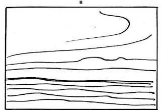


Diagram XIV.


12-43-2
 Diagram XVII.

Plate XXXIX.
 Plate XL.

1-26-4
On this contrast of line and form, so in sympathy with the {159} profound sentiment to which this picture owes its origin, the expressive power of this composition will be found to depend.
線と形のこのような対比の上に、この絵の根源にある深い感情と共鳴して、この作品の表現力は成り立っているのがわかるだろう。

ILLUSTRATING SOME OF THE LINES ON WHICH THE RHYTHMIC POWER OF THIS PICTURE DEPENDS.
図 XIII.
この絵のリズミカルな力が拠っている線のいくつかを示す

Plate XXXV.
Photo Hollyer
LOVE AND DEATH. BY G.F. WATTS
A noble composition, founded on the power of the right angle in the figure of Death, in contrast with the curved lines in the figure of Love. (See diagram opposite.)
図版 XXXV.
愛と死 G.F. ワッツ作
威厳の感じられる作品、死神の姿に見られる直角の効果に基づいている。それは、愛の神の姿に使われている曲線と対比されている。(反対の頁の図を参照)
12-27-1
In the diagram accompanying the reproduction of this picture I have tried to indicate in diagrammatical form some of the chief lines of its anatomy.
この絵の複製に添えた図を使って、私は、絵の構造を表す主な線の幾つかを概略的に示そうとした。
12-28-1
In these diagrams of the anatomy of compositions the lines selected are not always very obvious in the originals and are justly much broken into by truths of natural appearance. But an emotional significance depending on some arrangement of abstract lines is to be found underlying the expression in every good picture, carefully hidden as it is by all great artists.
作品の構造分析のためにこれらの図を描いたが、選択された線は、必ずしも元の絵の中ではっきりしたものではないし、当然ながら多くのところで対象のそのままの姿が割り込んでいる。しかし、抽象的な線の配置によって生まれる情動的な意味は、実際には巨匠によって注意深く隠されてはいるが、全ての優れた絵の表現の根底にあることが分かる。
12-28-2
And although some apology is perhaps necessary for the ugliness of these diagrams, it is an ugliness that attends all anatomy drawings. If the student will trace them and put his tracing over the reproductions of the originals, they will help him to see on what things in the arrangement the rhythmic force of the picture depends.
これらの図の醜さには釈明が必要かもしれないが、あらゆる分析図には醜さは付きものなのだ。それを写しとって元の複製の上に置けば、絵のリズミカルな力が配置のどんなところから生まれるのか理解できるだろう。
12-29-1
Other lines, as important as those selected, may have been overlooked, but the ones chosen will suffice to show the general character of them all.
選んだ線と同じく重要な線を他に見落としているかもしれないが、作品の一般的性格を示すには、選択した線で十分足りているだろう。
12-30-1
There is one condition in a composition, that is laid down before you begin, and that is the shape of your panel or canvas. This is usually a rectangular form, and all the lines of your design will have to be considered in relation to this shape. Vertical and horizontal lines being parallel to the boundaries of rectangular pictures, are always right and immediately set up a relationship, as we have seen.
絵には始める前から定められた前提条件がある。つまり使用するパネルあるいはキャンバスのかたちである。これは普通長方形をしている。構図のあらゆる線はこのかたちに関係づけて考える必要があるだろう。長方形の絵の境界と並行な垂直線と水平線は必ず直交し、直ちに関連が成立する。これまで見てきたとうりである。
⚑ rightの使用例:the fact that the four angles made by perpendicular lines are right can be deduced, using supplementary and/or vertical angles, from the fact that one of angles is right.
⚑ rightの使用例:the fact that the four angles made by perpendicular lines are right can be deduced, using supplementary and/or vertical angles, from the fact that one of angles is right.
12-31-1
The arresting power of the right angle exists at each corner of a rectangular picture, where the {160} vertical sides meet the horizontal base, and this presents a difficulty, because you do not wish the spectator's attention drawn to the corners, and this dramatic combination of lines always attracts the eye. A favourite way of getting rid of this is to fill them with some dark mass, or with lines swinging round and carrying the eye past them, so that the attention is continually swung to the centre of the picture. For lines have a power of directing the attention, the eye instinctively running with them, and this power is of the greatest service in directing the spectator to the principal interest.
直角には人目を引く力があり、四角い絵のそれぞれ角にある。そこでは垂直の側辺が水平の底辺とぶつかる。ここで問題が生じる。鑑賞者の注意を隅にもっていきたくないのに、線のこの劇的な組み合わせが常に目を引き付けてしまう。これを避けるのに好んでとられるのは、隅を暗いマッス(塊り)か、もしくは丸く弧を描く線で埋めることで視線をそこから遠ざける方法である。こうすると注意は絵の中央に常に戻される。線には注意を方向づける力があり、視線は本能的に線とともに動くからだ。この力は見る者の注意をを重要な事柄に向かわせるのに大いに役立つ。
12-32-1
It is this trouble with the corners that makes the problem of filling a square so exacting. In an ordinary rectangular panel you have a certain amount of free space in the middle, and the difficulty of filling the corners comfortably does not present itself until this space is arranged for. But in a square, the moment you leave the centre you are in one or other of the corners, and the filling of them governs the problem much more than in the case of other shapes. It is a good exercise for students to give themselves a square to fill, in order to understand this difficulty and learn to overcome it.
正方形をいっぱいに使うのが難しいのは、この隅にまつわる厄介さがあるためである。一般的な長方形の枠では中央にかなりの自由なスペースがあり、そこが決まるまで隅を上手く埋める難しさは現れてこない。しかし、真四角では、中央を離れるとすぐに、どれかの隅にはいりこみ、他のどの形の場合よりも、隅を埋めることが問題を左右することになる。正方形を埋める課題に学生が取り組むのは、この難しさを理解し、克服する手立てを学ぶのにうってつけである。
⚑ this space
12-33-1
Other lines that possess a direct relation to a rectangular shape are the diagonals. Many compositions that do not hang on a vertical or horizontal basis are built on this line, and are thus related to the bounding shape.
それ以外の線で長方形に直接関係するのは対角線である。垂直線や水平線に基づかない構図の多くは、この線上に構成されていて、こうして境界の四角い枠に関係づけられる。
⚑ the bounding shape:参考)a bounding rectangle境界を示す長方形; 四角い枠『ビジネス技術実用英語大辞典』

Photo Anderson
Plate XXXVI.
THE SURRENDER OF BREDA VELAZQUEZ (PRADO)
図版 XXXVI.
ブレダの開城 ベラスケス(プラド美術館)
12-34-1
When vertical, horizontal, or diagonal lines are referred to, it must not be assumed that one means in all cases naked lines. There is no pure vertical line in a stone pine or cypress tree, nor pure horizontal {161} line in a stretch of country, but the whole swing of their lines is vertical or horizontal. And in the same way, when one speaks of a composition being hung upon a diagonal, it is seldom that a naked diagonal line exists in the composition, but the general swing is across the panel in harmony with one or other diagonal. And when this is so, there is a unity set up between the design and its boundaries.
水平線や垂直線や対角線を探すとき、全ての場合それがそのまま明白な線であるというようには考えてはならない。カサマツにもイトスギにも純粋な垂直線は見られないし、広がる大地にも純粋な水平線は存在しない。その線の全体的流れが垂直あるいは水平なのだ。同様に、対角線にそって構築された構図について言えば、作品の中に対角線がそのままあることなどめったにない。全体的流れがいずれかの対角線と調和して枠を横切っているのだ。この時、構図(デザイン)とその境界との間に統一が生まれる。
12-34-2
A good instance of vertical, horizontal, and diagonal lines to unite a picture is Velazquez's "The Surrender of Breda," here reproduced. Note the vertical chord in the spears on the left, continued in the leg of the horse and front leg of the figure receiving the key, and the horizontal line made by the dark mass of distant city, to be continued by the gun carried over the shoulder of the figure with the slouch hat behind the principal group. Velazquez has gone out of his way to get this line, as it could hardly have been the fashion to carry a gun in this position, pointing straight at the head of the man behind. Horizontal lines also occur in the sky and distant landscape, one running right through the group of spears.
垂直線や水平線、対角線が絵を統一する良い例がここに掲載したベラスケスの『ブレダの開城』である。左手の槍の垂直な感じが馬の脚と鍵を受け取る男の手前の脚まで続き、そして遠くの町の暗い塊り(マッス)によって作られた水平線が、主要な人物達の背後のスローチハットの男が担いだ銃へと続いている。ベラスケスは意図的にこの線を作っている。後ろの人の頭に真直ぐ銃を向けるような担ぎ方が一般的であったはずがないからだ。水平線は空と遠くの風景にもある。うちひとつは一群の槍を真直ぐに抜けて延びている。
⚑ chord:訳?「感じ、情感」
⚑ on the left:向かって左ではなく、絵から見て左か?どの槍を指しているのだろう。
12-34-3
The use of the diagonal is another remarkable thing in the lines of this picture. If you place a ruler on the slanting line of the flag behind the horse's head to the right, you find it is exactly parallel to a diagonal drawn from the top right-hand corner to the lower left-hand corner. Another line practically parallel to this diagonal is the line of the sword belonging to the figure offering the key, the feeling of which is continued in the hand and key of this same figure. It may be noted also that the back right leg of the horse in the front is parallel to the other diagonal, the under side of it {162} being actually on the diagonal and thus brought into relation with the bounding lines of the picture. And all these lines, without the artifice being too apparent, give that well-knit, dignified look so in harmony with the nature of the subject.
この絵の線の中では、もうひとつ対角線の用い方が特筆すべきことである。右の馬の頭の後ろにある旗の斜めの線に定規を当てれば、それが右上の隅から左下へと引かれる対角線にぴったり平行になっていることが分かるだろう。この対角線にほぼ平行なもう一つの線は、鍵を差し出す人物が帯びている剣の線である。この線の感じは同じ人物の手と鍵に続いている。手前の馬の後ろ右脚は、もう一方の対角線と平行であるのにも注目するとよいだろう。その脚の下側は実際に対角線上にあり、これによって絵の境界線と関係している。そして、これら全ての線の働きによって、わざとらしさをさほど目立せずに、絵が対象の性格に調和してよくまとまり堂々として見えるのである。
Curved Lines
曲線
12-35-1
Curved lines have not the moral integrity of straight lines. Theirs is not so much to minister to the expression of the sublime as to woo us to the beauteous joys of the senses. They hold the secrets of charm. But without the steadying power of straight lines and flatnesses, curves get out of hand and lose their power. In architecture the rococo style is an example of this excess.
曲線には直線に備わる精神的な完全性がない。崇高の表現のために奉仕するというより、感覚の麗しい喜びへといざなう。曲線は人を魅了する秘密を握っているのだ。しかし直線や平面が持つ安定させる力がなければ、収拾がつかなくなり、力を失ってしまう。建築で言えば、ロココ様式がこの行き過ぎの例である。
12-35-2
While all expressions of exuberant life and energy, of charm and grace depend on curved lines for their effect, yet in their most refined and beautiful expression they err on the side of the square forms rather than the circle. When the uncontrolled use of curves approaching the circle and volute are indulged in, unrestrained by the steadying influence of any straight lines, the effect is gross. The finest curves are full of restraint, and excessive curvature is a thing to be avoided in good drawing. We recognise this integrity of straight lines when we say anybody is "an upright man" or is "quite straight," wishing to convey the impression of moral worth.
あふれるばかりの活気、優美さの表現は、間違いなく、その効果を曲線に負っているが、その最も洗練された美しい表現では、どちらかと言えば円よりもむしろ四角い形に重心を置く。円や螺旋に近づいていく曲線を野放図に使いすぎると、直線によって安定化されず、下品なものとなる。見事な曲線は抑制が十分に効いている。よい素描をするには、曲線の使い過ぎは避けるべきことである。高い道徳的印象を伝えようとするとき「まっすぐな男だ」とか「実直だ」と言うのは、この直線に備わる高潔性を認めてのことである。
12-36-1
Rubens was a painter who gloried in the unrestrained expression of the zeal to live and drink deeply of life, and glorious as much of his work is, and wonderful as it all is, the excessive use of curves and rounded forms in his later work robs it of much of its power and offends us by its grossness. His best work is full of squarer drawing and planes.
ルーベンスは生を謳歌する奔放な表現に優れた画家であり、作品の多くが壮麗で、見事なのだが、後期の作品では曲線と丸い形が過剰に使われ、力強さがなくなり、下品さが鼻につく。彼の最高傑作はもっと角張った線と面に富んでいる。
{163}
12-37-1 Always be on the look out for straightnesses in curved forms and for planes in your modelling.
曲がった形の中には直線を、立体表現には平面を常に探し求めること。
12-38-1
Let us take our simplest form of composition again, a stretch of sea and sky, and apply curved lines where we formerly had straight lines. You will see how the lines at A, page 164 [Transcribers Note: Diagram XIV], although but slightly curved, express some energy, where the straight lines of our former diagram expressed repose, and then how in B and C the increasing curvature of the lines increases the energy expressed, until in D, where the lines sweep round in one vigorous swirl, a perfect hurricane is expressed. This last, is roughly the rhythmic basis of Turner's "Hannibal Crossing the Alps" in the Turner Gallery.
最も単純な構図、海と空の広がりを再び採り上げよう。前は直線であったところに曲線を適用する。164頁のAではほんの少しだけ曲げてあるだけだが、活力が表現されるのが分かるだろう。一方以前の説明図の直線は静けさを表していた。BとCでは線の曲がり具合が大きくなるにつれ表現される活力はそれだけ大きくなり、Dに至ると線は舞い上がるように吹き付けられて力強い渦巻となり、完璧な嵐が表現されている。最後のものは、概ね、ターナーギャラリー所蔵の彼の作品『アルプスを越えるハンニバル』のリズムの基礎となっている。
⛾ the Turner Gallery:ターナー展示室?。この作品はターナーからイギリス国民に遺贈され、1910年にはナショナルギャラリーからテートギャラリーに移された。(Wikipedia)
 | |
| William Turner Snow Storm: Hannibal and his Army Crossing the Alps© Tate |
12-39-1
One of the simplest and most graceful forms the tying lines of a composition may take is a continuous flow, one line evolving out of another in graceful sequence, thus leading the eye on from one part to another and carrying the attention to the principal interests.
構図を繋ぐ線の最もシンプルで優美な形態はのひとつは、連続した流れである。次から次へと一本の線が順に別の線から優美に現れる。このようにして視線をある部分から別のところへと導き、重要な対象へと注意を向ける。
⚑ the tying lines of a composition :意味?
12-40-1
Two good instances of this arrangement are Botticelli's "Birth of Venus" and the "Rape of Europa," by Paolo Veronese, reproduced on pages 166 [Transcribers Note: Diagram XV, Plate XXXVII] and 168 [Transcribers Note: Diagram XVI, Plate XXXVIII]. The Venetian picture does not depend so much on the clarity of its line basis as the Florentine.
この配列方法の好例に、166頁と168頁に掲載したボッティチェリの『ヴィーナスの誕生』とパオロ・ヴェロネーゼの『エウロペーの誘拐』がある。ヴェネチア派の絵はフィレンツェ派ほどには線を用いる明快さを拠りどころとしていない。。
⚑ arrangement:配列方法?
12-40-2
And it is interesting to note how much nearer to the curves of the circle the lines of Europa approach than do those of the Venus picture. Were the same primitive treatment applied to the later work painted in the oil medium as has been used by Botticelli in his tempera picture, the robustness of the curves would have offended and been too gross for the simple formula; whereas overlaid and hidden under such a rich abundance of natural truth as it is in this gorgeous picture, we are too {167} much distracted and entertained by such wealth to have time to dwell on the purity of the line arrangement at its base. And the rich fullness of line arrangement, although rather excessive, seen detached, is in keeping with the sumptuous luxuriance the Venetian loved so well to express.
また、エウロペーの線がヴィーナスの絵の線と比較して丸い曲線にどれほど近付いているのか注目すると面白い。仮に、ボッティチェリがテンペラ画に用いているのと同じ初期の表現方法を使って、もっと後の油彩の作品が描かれていたならば、そこに表れる曲線の強さは不快であり、シンプルな方法故に目立ちすぎていたであろう。一方、この豪華な絵のように、おびただしい見た目の真実味で覆い隠されていると、この贅沢に目を奪われ満足してしまい、その基礎にある純粋な線の配列についてゆっくりと考える余裕がない。そして豊満な線の配列は、やや行き過ぎのきらいはあるが、客観的にみれば、ヴェネチア派が取り分け好んで表現した贅をこらしたきらびやかさに調和している。
⚑ for the simple formula:forを「~故に」とした。
12-40-3
But for pure line beauty the greater restraint of the curves in Botticelli's picture is infinitely more satisfying, though here we have not anything like the same wealth and richness of natural appearance to engage our attention, and the innocent simplicity of the technique leaves much more exposed the structure of lines, which in consequence play a greater part in the effect of the picture.
しかし、純粋な線の美しさで言えば、ボッティチェリの絵に見られるように、曲線が強く抑制されている方が、はるかに満足を与える。ボッティチェリの絵には、我々の関心を引くような見たままの姿の豊かさはないし、技巧が無邪気でシンプルなので線の構造がずっと露わに見える。これが、結果として絵の効果に重要な役割を演じているのである。


ILLUSTRATING POWER OF CURVED LINES TO CONVEY ENERGY.
図 XIV.
曲線の効果が活力を表現することを示す

Diagram XV.
ILLUSTRATING THE FLOW OF LINES ON WHICH THE RHYTHMIC UNITY OF THIS PICTURE DEPENDS.
図 XV.
この絵にリズミカルな統一を生んでいる線の流れを示す。

Photo Anderson
Plate XXXVII.
THE BIRTH OF VENUS. BOTTICELLI (FLORENCE)
A beautiful example of Botticelli's refined line rhythm. (See diagram on opposite page for analysis.)
図版 XXXVII.
ヴィーナスの誕生 ボッティチェリ(フィレンツェ)
ボッティチェリの洗練された線のリズムを示す美しい実例(分析は向かいの頁の図を参照)
12-41-1
In both cases note the way the lines lead up to the principal subject, and the steadying power introduced by means of horizontal, vertical, and other straight lines. Veronese has contented himself with keeping a certain horizontal feeling in the sky, culminating in the straight lines of the horizon and of the sea edge. And he has also introduced two pyramids, giving straight lines in among the trees, the most pronounced of which leads the eye straight on to the principal head.
どちらの場合も、線は視線を主要な対象に導くことをよく見よう。水平線や垂直線やその他の直線が作る安定感を生み出す効果にも注意のこと。ヴェロネーゼは空に一定の水平の感じを保つことで良しとした。その感じは最後には水平線や海岸線の直線となってはっきりする。ピラミッド形二つを使って木々の間に直線を作り、そのうち最も目立つ直線は視線を主要な頭部に真直ぐに向けさせる。
⚑ culminating in the straight lines of the horizon and of the sea edge:この意味がはっきりしません。なんとなく上の訳のような意味になると思うのですが。
12-42-1
Botticelli has first the long line of the horizon echoed in the ground at the right-hand lower corner. And then he has made a determined stand against the flow of lines carrying you out of the picture on the right, by putting straight, upright trees and insisting upon their straightness.
ボッティチェリは、まず、長い水平線を右手下隅で繰り返している。次に、右側に真っすぐに立った木を置いて直線性を強調することで、視線を絵の外へと向かわせる線の流れに対してしっかりとした壁を構築した。

Diagram XVI.
ILLUSTRATING SOME OF THE MAIN LINES ON WHICH THE RHYTHMIC UNITY OF THIS PICTURE DEPENDS.
図 XVI.
この絵のリズミカルな統一を作り出している主要な線を示す。

Plate XXXVIII.
Photo Anderson
THE RAPE OF EUROPA. BY PAOLO VERONESE (VENICE)
A composition of rich full forms and rich full colour. (See the diagram on opposite page for analysis of line rhythm.)
エウロペの略奪 パオロ・ベロネーゼ作(ヴェニス)
豊かな形と色彩の構図。(向かいの頁の図を参照。線によるリズムについて分析)
⛾ ヴェニス ドゥカーレ宮殿
12-43-1
Another rhythmic form the lines at the basis of a composition may take is a flame-like flow of lines; curved lines meeting and parting and meeting again, or even crossing in one continual movement onwards. A striking instance of the use of this {169} quality is the work of the remarkable Spanish painter usually called El Greco, two of whose works are here shown (page 172 [Transcribers Note: Plate XL]).
構図の根底にある線がとるもう一つのリズミカルな形態は、炎のような線の流れである。合っては離れまた合う、その先で交わって同じ流れとなることさえある。この特質を用いた驚くべき実例は、スペインの類まれな画家、通称エル・グレコの作品である。2作品をここに紹介する(172頁)。
⚑ the lines at the basis of a composition may take:は、
the lines may take at the basis of a compositionの倒置なのか、それとも、そのまま
【the lines at the basis of a composition】 may take なのか?
the lines may take at the basis of a compositionの倒置なのか、それとも、そのまま
【the lines at the basis of a composition】 may take なのか?
12-43-2
Whatever may be said by the academically minded as to the incorrectness of his drawing, there can be no two opinions as to the remarkable rhythmic vitality of his work. The upward flow of his lines and the flame-like flicker of his light masses thrills one in much the same way as watching a flaring fire. There is something exalting and stimulating in it, although, used to excess as he sometimes uses it, it is apt to suffer from lack of repose.
彼の素描の不正確さについてアカデミックな考えの人々からなんと言われようと、その作品の素晴らしいリズミカルな生命力については異論のあるはずはない。彼の描いた上へと伸びる線の流れや明るいマッス(塊り)の炎のような揺らめきを見ると、ちょうどめらめらと燃えさかる炎を見る時のようにぞくぞくする。そこには気持ちを高揚させ鼓舞させるものがあるのだ。とは言え、彼にも時折見られるが、過度に使うと落ち着きに欠けたものになりがちである。
⚑ これらの it はそれぞれ何を指すか。:The upward flow of his lines and the flame-like flicker of his light massesを指していると解しました。単数で受けているのが気になりますが。
12-43-3
Two examples of his pictures are reproduced here, and illustrate his use of this form of movement in the lines and masses of his compositions. Nowhere does he let the eye rest, but keeps the same flickering movement going throughout all his masses and edges. The extraordinary thing about this remarkable painter is that while this restless, unrestrained form of composition makes his work akin to the rococo work of a later period, there is a fiery earnestness and sincerity in all he does, only to be matched among the primitive painters of the fourteenth and fifteenth centuries, and very different from the false sentiment of the later school.
彼の絵の二例をここに掲載したが、これらを見ると、彼が作品を構成するうえで線やマッスの動的効果をどのように用いたか、その使い方がわかる。どこにも目を休まさせるところは作らない。マッスやエッジの至る所にゆらめくような動きを繰り返す。この静止することのない、のびのびした構図の形態は、後の時代のロココの作品と類似してはいるが、この比類のない画家の驚くべきところは、これを全て心底熱情的な心で行うところである。これは14・15世紀のプリミティブの画家達に見られるだけで、後の流派の誤った感傷とは全く別物である。
⛾ the primitive painters:プリミティブ.(1)イタリア盛期ルネッサンス以前の,主として15世紀のイタリア,フランドル,フランスなどの画家『ランダムハウス
12-44-1
Blake was also fond of this flame line, but usually used it in combination with more straight lines than the energetic Spaniard allowed himself. Plates III and V in the Job series are good examples of his use of this form. In both cases it will be seen that he uses it in combination with the steadying influence of straight lines, which help to keep the balance and repose necessary in the treatment of even the most violent subjects in art.
ブレイクもこの炎のような線を好んだが、エネルギッシュなスペイン人のグレコに比べると直線と組み合わせて用いることが多かった。ヨブの連作の図版IIIと V は彼のこの形態の使用方を示す好例である。両方とも直線の安定感を作り出す効果と組み合わせて使っているのが分かるだろう。こうして、芸術におけるもっとも激しい主題を扱う場合でさえも必要とされるバランスと安らぎを保っているのである。
12-45-1
A continual interruption in the flow of lines, and {171} a harsh jarring of one against another in an angular, jagged fashion, produces a feeling of terror and horror. A streak of fork lightning is a natural example of this. The plate of Blake's No. XI, p. 148 [Transcribers Note: Plate XXXII], reproduced here, is also a good example. I have had it put sideways on so that you may see that the look of horror is not only in the subject but belongs to the particular music of line in the picture.
線の流れが度々とぎれ、線どうしがジグザグ状に激しくきしむようにぶつかると、そこには恐怖の感情が生まれる。稲妻はこれの自然界の実例である。148頁に複製したブレイクの版画No. XIもよい例である。横にして掲載してあるので、恐ろしく見える理由は主題のにあるだけでなく、絵の中の線による特定の音楽に在るのが分かるだろう
⚑ music of line:線の音楽、線による音楽、線でつくられた音楽、線という音楽、音楽のような線?
12-45-2
The effect of the harsh contrasts in the lines is further added to by the harsh contrasts of tone: everywhere hard lights are brought up against hard darks. Harsh contrasts of tone produce much the same look of terror as harsh contrasts of line. Battle pictures are usually, when good, full of these clashes of line and tone, and thrilling dramatic effects in which a touch of horror enters are usually founded on the same principle. In the picture by Paolo Uccello in the National Gallery, reproduced on page 170 [Transcribers Note: Plate XXXIX], a milder edition of this effect is seen.
線によってつくられる際立ったコントラストの効果は、強い調子のコントラストによってさらに強められる。強い明部は強い暗部といたるところで対置される。強く調子を対比させることによって、強く線を対比させるのとほぼ同様に、恐ろしく見えるようになる。戦の絵はたいてい、良いものであれば、線と調子のこのようなぶつかりあいで満ちている。恐怖感の湧くぞくぞくするような劇的効果はたいてい同じ原則に基づいている。170頁に写真を掲載したナショナルギャラリーにあるパオロ・ウッチェロの絵には、この効果のより穏やかな形式が見られる。
⛾ Paolo Uccello:パオロ・ウッチェロ⦅1397‐1475; イタリアのフィレンツェ派の画家; 本名 Paolo di Dono /dóːno/⦆.『新英和
12-45-3
The artist has been more interested in the pageantry of war and a desire to show off his newly-acquired knowledge of perspective, than anything very terrible. The contrasts of line are here but confined to the smaller parts, and there are no contrasts of light and shade, chiaroscuro not being yet invented. However, it will be seen by the accompanying diagram how consistently the harsh contrasts of line were carried out in the planning of this picture. Notice the unconscious humour of the foreshortened spears and figure carefully arranged on the ground to vanish to the recently discovered vanishing point.
この画家は戦争の恐怖よりもその壮観な様子のほうに関心があり、習得したての遠近法の知識を誇示したいという願望を持っている。線のコントラストはここでは小さな部分だけに限られ、明暗のコントラストはない。明暗法はまだ発明されていなかった。しかし、線の際立ったコントラストはこの絵の構想段階で一貫して考えられていたことが、添付の図から分かるだろう。短縮法で描かれた槍や人物が、当時発見されたばかりの消失点に向かうように、注意深く地面に配置されるという意図するところではなかったユーモアが生じているのに注意のこと。

SHOWING THE CLASH OF LINES IN SYMPATHY WITH THE MARTIAL NATURE OF THIS SUBJECT.
図 XVII.
主題の勇壮な性質に合せて線と線がぶつかりあっていることを示す。

Photo Morelli
BATTLE OF ST. EGIDIO. PAOLO UCCELLO (NATIONAL GALLERY)
Illustrating the effect of jarring lines in composition. (See diagram on opposite page.)
図版 XXXIX.
「サン・エジディオの戦い」パオロ。ウッチェロ作(ナショナルギャラリー)
線どうしがきしみあう効果を描いている。(向かいの頁の図を参照)
⛾ BATTLE OF ST. EGIDIO:現在は"the battle of San Romano"(『サン・ロマーノの戦い』 )と題されている。「His best known works are the three paintings representing the battle of San Romano, which were wrongly entitled the "Battle of Sant' Egidio of 1416" for a long period of time.」 wikiより
12-46-1
Lines radiating in smooth curves from a common centre are another form employed to give unity in pictorial design. The point from which they radiate {172} need not necessarily be within the picture, and is often considerably outside it. But the feeling that they would meet if produced gives them a unity that brings them into harmonious relationship.
同じ中心から滑らかな曲線となって放射状にのびる線は、絵の構成(デザイン)に統一を与えるもう一つの形態である。放射の中心点は必ずしも絵の中にあるとはかぎらない。絵からかなり外れたところにあることも多い。しかし、描けば線は中心に集まるだろうという感じがあるので、線どうしが調和のとれた関係になる統一感が生まれる。
12-47-1
There is also another point about radiating lines, and that is their power of setting up a relationship between lines otherwise unrelated. Let us try and explain this. In Panel A, page 174 [Transcribers Note: Diagram XVIII], [are drawn some lines][/some lines are drawn/] at random, with the idea of their being as little related to each other as possible. In B, by the introduction of radiating lines in sympathy with them, they have been brought into some sort of relationship. The line 1-2 has been selected as the dominating line, and an assortment of radiating ones drawn about it. Now, by drawing 7-8, we have set up a relationship between lines 3-4, 5-6, and 1-2, for this line radiates with all of them. Line 9-10 accentuates this relationship with 1-2. The others echo the same thing. It is this echoing of lines through a composition that unites the different parts and gives unity to the whole.
放射状に伸びる線にはもうひとつ重要な点がある。それは、他には関係づけようのない線どうしを関係づける力である。説明してみよう。174頁の画面Aでは、お互い出来るだけ関係しないようでたらめに線が何本か引かれている。Bでは、これらの線と同調した放射状の線を加えることで、そこにある種の関係性が生じる。線1-2が主たる線として選ばれていて、とりどり放射状に伸びる線がまわりに引かれる。線7-8を引く。すると線3-4、5-6、1-2の間に関連が生まれる。この線が、ほかの全ての線と放射状をなす関係にあるからだ。線9-10にはこの1-2との関係を強める働きがある。残りも同じものに共鳴する。この構図の端から端まで響きわたる線の共鳴こそが、別々の部分を結びつけて全体を統一するのである。
⚑ The others echo the same thing.:「他もそっくり同じである」と言う意味か?次の文のechoingから上記のように訳してみました。
⚑ [/some lines are drawn/]第二版より
⚑ [/some lines are drawn/]第二版より
12-48-1
The crossing of lines at angles approaching the right angle is always harsh and somewhat discordant, useful when you want to draw attention dramatically to a particular spot, but to be avoided or covered up at other times. There is an ugly clash of crossing lines in our original scribble, and at C we have introduced a mass to cover this up, and also the angles made by line 3-4 as it crosses the radiating lines above 1-2. With a small mass at 11 to make the balance right, you have a basis for a composition, Diagram C, not at all unpleasing in arrangement, although based on a group of discordant lines drawn at random, but brought into harmony by means of sympathetic radiation.
直角に近い角度で交差する線はいつもとげとげしく、いくらか調和を欠く。特定の場所に印象的に注意を引き付ける時は効果的だが、避けるべきだし、さもなければ隠したほうがよい。先に挙げたもとの画には交差する線の醜い不調和があった。Cではこれを覆うためにマッス(塊り)を描き加え、さらにまた、線3-4が1-2の上方で放射状の線と交わってできる角も隠した。11のところに小さなマッスを加えてバランスをとることで、図Cの構図の基礎ができる。でたらめに引かれた不協和な線の集まりに基づいてはいるが、構成に少しも不快なところがなく、同調する放射状の線によって調和が生まれている。

Photo Anderson
THE ASCENSION OF CHRIST. BY DOMINICO THEOTOCOPULI CALLED EL GRECO.
Note the flame-like form and flow of the light masses, and the exalted feeling this conveys.
図版 XL.
キリストの昇天 ドメニコス・テオトコプーロス 通称エル・グレコ作
炎のような形と明るいマッスの流れ、そしてこれらによって生まれる高揚感に注目
Plate XLI.
Photo Anderson
THE BAPTISM OF CHRIST. BY DOMINICO THEOTOCOPULI CALLED EL GRECO
Another example of his restless, flame-like composition.
図版 XLI.
キリストの洗礼 ドメニコス・テオトコプーロス 通称エル・グレコ作
エル・グレコの休むことのない、炎のような構図をもう一例
⛾ エル・グレコ 1541‐1614
スペイン語名 Domingo Theotocopuli,
イタリア語名 Domenico Teotocopulo
上記の2作品はいずれもプラド美術館所蔵
{173}
12-49-1
In Panel D the same group is taken, but this time line 3-4 is used as the dominant one. Line 7-8 introduces 3-4 to 1-2, as it is related to both. Lines 9-10 and 11-12 introduce 3-4 to 5-6, as they are related to both, and the others follow on the same principle. By introducing some masses covering up the crossings, a rhythmic basis for a composition (Diagram E) entirely different from C is obtained, based on the same random group.
画面Dでは、同じ組み合わせが使われているが、今度は線3-4が主要な線となっている。線7-8は、3-4と1-2を仲立ちする。両方に関係しているからである。そして線9-10と11-12は3-4と5-6を仲立ちする。両方に関係しているためである。ほかも同じ原理に従う。交差するところを隠すためマッスを描き加えると、構図(図E)のためのリズミカルな基礎が完成する。同じ不規則な組み合わせから出来てはいるが、Cとは全く異なるものだ。
12-50-1
In Panel F, [1-2][/5-6/] has been taken as the dominant line, and sympathetic lines drawn on the same principle as before. By again covering the crossings and introducing balancing masses we obtain yet another arrangement from the same random scribble.
画面Fでは、5-6が主要な線となっている。前と同じ原理で同調する線を引く。また同様に交差するところを覆い、バランスをとるためのマッスを加えると、同じ不規則な画からまた別の配置ができる。
⚑ [/5-6/]:第二版より
12-51-1
I would suggest this as a new game to students, one giving another two or three lines drawn in a panel at random, the problem being to make harmonious arrangements by the introduction of others radiating in sympathy.
学生にはこれを新しいゲームとしてお勧めしたい。一方が一方へ不規則な線を二・三本パネルに描いて渡す。これに放射状にのびて同調する線を描き加えて調和のとれた配置を作りだすのが解くべき問題となる。
12-52-1
Often in a picture certain conditions are laid down to start with; something as ugly as our original group of lines drawn at random has to be treated pictorially, and it is by means such as here suggested that its discordancy can be subdued and the whole brought into harmony with the shape of your panel. The same principles apply in colour, discordant notes can be brought into harmony by the introduction of others related to both the original colours, thus leading the eye from one to the other by easy stages and destroying the shock. Somewhat in the way a musician will take you from one key into another very remote by means of a few chords leading from the one to the other; whereas, had he taken you straight there, the shock would have {175} been terrible. As it is, these transitions from one key into another please and surprise one, and are very effective.
絵には、初めに、ある条件が存在することが多い。前の例で用いたでたらめに引いた最初の線の組み合わせのように、醜いものを絵画として扱わねばならない。それは、ここで提唱したように、その不調和なところを抑制し、用いている枠のかたちにあわせて全体を調和させることで行うのである。同じ原理は色の場合にもあてはまる。基の両方の色に関係した別の色を加えることで不協和な調子を調和させることができ、こうして目をひとつの色から別の色へと徐々に導き、ショックを無くすのである。音楽家がひとつのキーから別のかなり離れたキーに移る際、一方からもう一方へつながる和音をいくつか用いるのといくらか似たところがある。直接に移動したなら、衝撃は大きかったであろう。実際、ひとつのキーから別のキーへの移動は快くもあり驚かされることもある。とても効果的なものなのだ。
{174}
 Diagram XVIII.
B. TAKING LINE 1-2 AS DOMINANT LINE.
C. AS AT B BUT WITH ADDITION OF MASSES TO COVER LINES CROSSING AND RESTORE BALANCE
D. TAKING LINE 3-4 AS DOMINANT LINE
E. AS AT D BUT WITH ADDITION OF MASSES TO COVER LINES CROSSING AND GIVE BALANCE
F. TAKING LINE 5-6 AS DOMINANT LINE
G. AS AT F BUT WITH MASSES TO COVER LINES CROSSING & TO GIVE BALANCE
図 XVIII.


12-59-1
The other form accentuated by the line arrangement is the oval of the face. There is [ ][/first/]the necklace the lines of which lead on to those on the right in the reflection. It is no mere accident that this chain is so in sympathy with the line of the face: it would hardly have remained where it is for long, and must have been put in this position by the artist with the intention (conscious or instinctive) of accentuating the face line.
他に線の配置によって強調されている形は顔の楕円である。まずネックレスの線があって、鏡像中の右側の線へと通じている。このネックレスの鎖が顔の線とよく共鳴しているのは偶然ではない。今あるところにそのまま長くとどまることはまずなかっただろう。顔の線を(意識的にか本能的に)強調しようと意図し、画家がこの位置に置いたにちがいない。
⚑ [/first/]:第二版より
12-59-2
The line of the reflection on the left and the lines of the mirror are also sympathetic. Others in the folds of the dress, and those forming the mass of the hands and arms, echo still further this line of the face and bring the whole canvas into intense sympathetic unity of expression.
鏡に映った左手の線と鏡の線も同調している。他にドレスのひだの線、そして手と腕のマッスを作る線がこの顔の線とさらに響きあい、キャンバス全体が強く共鳴しあう表現の統一感が生まれている。
12-60-1
The influence that different ways of doing the hair may have on a face is illustrated in the accompanying scribbles. The two profiles are exactly alike—I took great trouble to make them so. It is quite remarkable the difference the two ways of doing the hair make to the look of the faces. The upward swing of the lines in A sympathise with the line of the {180} [nose][/one/] and the sharper projections of the face generally (see dotted lines), while the full downward curves of B sympathise with the fuller curves of {181} the face and particularly emphasise the fullness under the chin so dreaded by beauty past its first youth (see dotted lines). It is only a very sharply-cut face that can stand this low knot at the back of the head, in which case it is one of the simplest and most beautiful ways of doing the hair. {182} The hair dragged up high at the back sharpens the lines of the profile as the low knot blunts them.
異なる髪の結い方が顔に与える効果を添付した略画に示してある。二つの横顔は全く同じである。そうするのにかなりてこずった。二つの髪の結い方で顔の見え方が違ってくるのは注目に値する。Aで見られるように線が上方へ弧を描いていると、上方へ弧を描く線や一般的に顔の尖った隆起部と同調する(点線を見るように)。一方Bの下方に湾曲した丸まった曲線は、顔の丸みを帯びた曲線と同調する。特に若い盛りを過ぎた美貌には嫌われる顎の下の肉付きを強調する(点線を見るように)。このように頭の後ろに低く巻髪を結うのが似合うのは、しまった細面の顔だけである。そのときは最もシンプルで美しい髪型のひとつとなる。横から見た顔の線は、髪を後で高く引き詰めると引き締まり、巻髪を低くまとめると丸みを帯びるのだ。
⚑ nose:第二版以降は”one"となっている。"nose"のままで意味が通じると思うのですが。

Diagram XXI.
ILLUSTRATING THE EFFECT ON THE FACE OF PUTTING THE HAIR UP AT THE BACK. HOW THE UPWARD FLOW OF LINES ACCENTUATES THE SHARPNESSES OF THE FEATURES.

12-61-1
The illustrations to this chapter have been drawn in diagrammatical form in order to try and show that the musical quality of lines and the emotions they are capable of calling up are not dependent upon truth to natural forms but are inherent in abstract arrangements themselves. That is to say, whenever you get certain arrangements of lines, no matter what the objects in nature may be that yield them, you will always get the particular emotional stimulus belonging to such arrangements.
この章に添えた挿絵は図式化して描いてある。これは、線の音楽的な性質や線が喚起しうる情動は、自然な見た目の本当らしさから来るのではなく、抽象的な配置そのものに本来備わっているものであることを示そうとしたためである。つまり、線を配置すると必ず、それが呼び起こす自然の対象が何であれ、その配置に付随する特定の情動的刺激をひとは決まって受ける。
12-61-2
For instance, whenever you get long uninterrupted horizontal lines running through a picture not opposed by any violent contrast, you will always get an impression of intense quiet and repose; no matter whether the natural objects yielding these lines are a wide stretch of country with long horizontal clouds in the sky, a pool with a gentle breeze making horizontal bars on its surface, or a pile of wood in a timber yard. And whenever you get long vertical lines in a composition, no matter whether it be a cathedral interior, a pine forest, or a row of scaffold poles, you will always have the particular feeling associated with rows of vertical lines in the abstract. And further, whenever you get the swinging lines of the volute, an impression of energy will be conveyed, no matter whether it be a breaking wave, rolling clouds, whirling dust, or only a mass of tangled hoop iron in a wheelwright's yard.
例えば、途切れのない水平線が目障りなコントラストで対比されることなく絵のなかを横切っているのを見ると、決まって深い静けさと安らぎを感じる。その線が生み出す自然の対象が、空に水平に伸びた雲の下の広々とした田園であれ、そよ風が吹いて水面に縞のできた池であれ、あるいは、材木置場に積まれた木材であれ問題ではない。そして、構図の中に長い垂直線があると、それが大聖堂の内部装飾であろうと、松の森であろうと、やぐらの柱の並びであろうと抽象的な垂直線の列に伴う特定の感情が必ず心に生まれる。さらには、螺旋状に弧を描く線からは、それが砕ける波、沸き上がる雲、渦巻く埃、あるいは車大工の作業場にあるもつれたただの帯鉄の塊にすぎなくとも、活力が湧いてくる印象を受ける。
12-61-3
As was said above, these effects may be greatly increased, modified, or even destroyed by associations connected with the things represented. If in painting the timber yard the artist is thinking more about making it look like a stack of real wood with its commercial associations {183} and less about using the artistic material its appearance presents for the making of a picture, he may miss the harmonic impression the long lines of the stacks of wood present. If real wood is the first thing you are led to think of in looking at his work, he will obviously have missed the expression of any artistic feeling the subject was capable of producing. And the same may be said of the scaffold poles or the hoop iron in the wheelwright's yard.
前に述べたように、表現されたものから思い浮かぶものによって、この効果は強められもすれば、弱められもし、また壊されることさえある。画家が材木置き場を描くのに、商売上の関連から材木の山を実物のように見せようと腐心し、材木置き場が見せる絵になる芸術的素材を使うことを考えるのを疎かにすると、材木の山の長い線が作りだす調和の印象を見落とすことだろう。その絵を見て最初に思い浮かぶものが実際の材木だとすれば、対象が作り出しえた芸術的感情を画家は明らかに表現し損なったのだろう。同じことは、足場の柱や車大工の作業場にある帯鉄についても言えるだろう。
12-62-1
This structure of abstract lines at the basis of a picture will be more or less overlaid with the truths of nature, and all the rich variety of natural forms, according to the requirements of the subject. Thus, in large decorative work, where the painting has to take its place as part of an architectural scheme, the severity of this skeleton will be necessary to unite the work to the architectural forms around it, of which it has to form a part; and very little indulgence in the realisation of natural truth should be permitted to obscure it.
絵の根底にあるこの抽象的な線の構造が、どれほど見たままの自然の姿に覆われ、どれほど自然の形の多様性に隠されているのか、その程度は、対象の要件に応じて、大きくもなり小さくもなる。例えば、規模の大きな装飾的作品では、絵画は建築設計の一部としての役割があり、作品を囲む壁面の形と一体化させるために、この骨格構造の重要度は大きいだろう。作品は建築の一部とならなければならず、骨格構造を曖昧にして自然の見た目にかまける余地はほとんどない。
⚑ ▶more or less ... が熟語としてではなく,more ... と less ... とが or によって接続されたものとして現れることがある:Oil is more or less expensive depending on global production levels. 石油は世界の生産水準の変化に応じて高かったり安かったりする.『ランダムハウス』
12-62-2
But in the painting of a small cabinet picture that exists for close inspection, the supporting power of this line basis is not nearly so essential, and a full indulgence in all the rich variety of natural detail is permissible. And this is how it happens that painters who have gloried in rich details have always painted small pictures, and painters who have preferred larger truths pictures of bigger dimensions. It sounds rather paradoxical to say the smaller the picture the more detail it should contain, and the larger the less, but it is nevertheless true.
しかし、近くで見ることを前提にした小さなキャビネットピクチャーのような絵では、この線による支持力はさほど重要なものではなく、自然の細部の多様性に好きなだけ係わりあっても差し支えない。このため、細部描写を得意とする画家は決まって小さな絵を描き、大きな真実味を好む画家は、大きな寸法の絵を描くのである。すこし奇妙に聞こえるかもしれないが、絵が小さければ小さいほど、多くの細部を含み、大きければそれだけ細部は少ない。しかし、これが事実である。
⚑ should:このshouldの意味は? 「べきである」 or 「はずである」 or ⦅that 節において,仮定法または仮定法相当語句を導く⦆『ランダムハウス』に該当か?
⛾ cabinet picture:キャビネットピクチャー ⦅もとは特別展示室に飾られた, 大体幅 90 cm 以下の小さな絵⦆『リーダーズ・プラス』
12-62-3
For although a large picture has not of necessity got to be part of an architectural scheme, it has to be looked at from a distance at which small detail could not be seen, and where such detail would greatly weaken its expressive power. {184} And further, the small picture easily comes within the field of vision, and the whole impression can be readily grasped without the main lines being, as it were, underlined. But in a big picture one of the greatest difficulties is to get it to read simply, to strike the eye as one impression. Its size making it difficult for it to be got comfortably within the field of vision, every artifice has to be used to give it "breadth of treatment," as it is called, and nothing interferes with this like detail.
というのは、大きな絵は、建築の一部であるとは限らないが、細部が見えないような距離から観賞する必要があり、そこでは、そのような細部の表現力は大きく弱まるものなのだ。さらに言えば、小さな絵は視野の中に簡単に収まり、主要な線が、言ってみれば、特筆されていなくとも、すぐに全体的印象を掴むことができる。しかし、大きな絵で最大の困難は、シンプルに把握させること、つまり一つの印象として見せることである。大きな絵は、その大きさ故に絵を視野の中に具合よく捉えることが容易ではないので、あらゆる手立てを講じていわゆる「雄大な効果」を与えねばならず、細部ほどこの妨げになるものはない。
⚑ get it to read:使役のgetと解釈しました。
⚑ Its size making it difficult for it to be got comfortably within the field of vision:独立分詞構文の句、最初のitは形式目的語、for itのitはa big pictureであると解釈しました。
⚑ "breadth of treatment," 意味不明。breadthの意味として辞書に 「細部や非本質的な部分を軽く扱うことから生じる)雄大な効果.」『ランダムハウス』とあったのでこれをそのまま使いました。
⚑ nothing interferes with this like detail.:◆Nothing like youth!若さに勝るものはない『ランダムハウス』
12-50-1
In Panel F, [1-2][/5-6/] has been taken as the dominant line, and sympathetic lines drawn on the same principle as before. By again covering the crossings and introducing balancing masses we obtain yet another arrangement from the same random scribble.
画面Fでは、5-6が主要な線となっている。前と同じ原理で同調する線を引く。また同様に交差するところを覆い、バランスをとるためのマッスを加えると、同じ不規則な画からまた別の配置ができる。
⚑ [/5-6/]:第二版より
12-51-1
I would suggest this as a new game to students, one giving another two or three lines drawn in a panel at random, the problem being to make harmonious arrangements by the introduction of others radiating in sympathy.
学生にはこれを新しいゲームとしてお勧めしたい。一方が一方へ不規則な線を二・三本パネルに描いて渡す。これに放射状にのびて同調する線を描き加えて調和のとれた配置を作りだすのが解くべき問題となる。
12-52-1
Often in a picture certain conditions are laid down to start with; something as ugly as our original group of lines drawn at random has to be treated pictorially, and it is by means such as here suggested that its discordancy can be subdued and the whole brought into harmony with the shape of your panel. The same principles apply in colour, discordant notes can be brought into harmony by the introduction of others related to both the original colours, thus leading the eye from one to the other by easy stages and destroying the shock. Somewhat in the way a musician will take you from one key into another very remote by means of a few chords leading from the one to the other; whereas, had he taken you straight there, the shock would have {175} been terrible. As it is, these transitions from one key into another please and surprise one, and are very effective.
絵には、初めに、ある条件が存在することが多い。前の例で用いたでたらめに引いた最初の線の組み合わせのように、醜いものを絵画として扱わねばならない。それは、ここで提唱したように、その不調和なところを抑制し、用いている枠のかたちにあわせて全体を調和させることで行うのである。同じ原理は色の場合にもあてはまる。基の両方の色に関係した別の色を加えることで不協和な調子を調和させることができ、こうして目をひとつの色から別の色へと徐々に導き、ショックを無くすのである。音楽家がひとつのキーから別のかなり離れたキーに移る際、一方からもう一方へつながる和音をいくつか用いるのといくらか似たところがある。直接に移動したなら、衝撃は大きかったであろう。実際、ひとつのキーから別のキーへの移動は快くもあり驚かされることもある。とても効果的なものなのだ。
{174}

SHOWING HOW LINES UNRELATED CAN BE BROUGHT INTO HARMONY BY THE INTRODUCTION OF OTHERS IN SYMPATHY WITH THEM.
A. LINES DRAWN AT RANDOM.B. TAKING LINE 1-2 AS DOMINANT LINE.
C. AS AT B BUT WITH ADDITION OF MASSES TO COVER LINES CROSSING AND RESTORE BALANCE
D. TAKING LINE 3-4 AS DOMINANT LINE
E. AS AT D BUT WITH ADDITION OF MASSES TO COVER LINES CROSSING AND GIVE BALANCE
F. TAKING LINE 5-6 AS DOMINANT LINE
G. AS AT F BUT WITH MASSES TO COVER LINES CROSSING & TO GIVE BALANCE
図 XVIII.
どのように関連のない線どうしに、それらに同調した線を加えることで、調和が生まれるのかを示す。
A. でたらめに引かれた線。
B. 線1-2を主要な線とする。
C. 線の交差を隠し、またバランスを取り戻すため、マッスを加えた。それ以外Bと同じ
D. 線3-4を主要な線とする。
E. 線の交差を隠し、またバランスを取るため、マッスを加えた。それ以外Dと同じ。
F. 線5-6を主要な線とする。
G. 線の交差を隠し、またバランスを取るため、マッスを加えた。それ以外Fと同じ。
⛾ Dには「11」が二か所ある。右上の「11」は、正しくは「10」か?
{175}

Diagram XIX.
SHOWING HOW LINES UNRELATED CAN BE BROUGHT INTO HARMONY BY THE INTRODUCTION OF OTHERS IN SYMPATHY WITH THEM.
H. LINES DRAWN AT RANDOM.
I. LINES DRAWN AT RANDOM.
J. ADDITIONAL LINES DRAWN TO RELATE ORIGINAL LINES AND BRING THE WHOLE INTO HARMONY TAKING LINE 1-2, AS DOMINANT.
K. ADDITIONAL LINES DRAWN TO RELATE ORIGINAL LINES TAKING 1-2 AS DOMINANT.
L. THE SAME AS J WITH ADDITION OF MASSES TO COVER CROSSING OF LINES.
M. THE SAME AS AT K WITH ADDITION OF MASSES TO COVER CROSSING LINES.
図 XIX.
どのように関連のない線どうしに、それらに同調した線を加えることで、調和が生まれるのかを示す。
H. でたらめに引かれた線。
I. でたらめに引かれた線。
J. もとの線を関連付けて全体を調和させるため線を追加する。線1-2を主要な線としてある。
K. もとの線を関連付けるため線を追加する。線1-2を主要な線としてある。
L. Jと同じ。線の交差するところを隠すためマッスを加えてある。
M. Kと同じ。線の交差するところを隠すためマッスを加えてある。
12-53-1
In H, I have introduced a straight line into our {176} initial scribble, and this somewhat increases the difficulties of relating them. But by drawing 7-8 and 9-10 radiating from 1-2, we have introduced this straight line to 5-6. For although 5-6 and 9-10 do not radiate from the same point, they are obviously in sympathy. It is only a short part of the line at the end marked 5 that is out of sympathy, and had 5-6 taken the course of the dotted line, it would have radiated from the same point as 9-10.
Hでは、最初に掲載した図に直線を追加した。これによって線どうしを関係づけるのが幾らか難しくなった。しかし、1-2から放射状に広がる7-8と9-10を描くことで、この直線を5-6と関連付けることができる。というのは、5-6と9-10は同じ点から放射状にのびている訳ではないが、そこには明らかに同調するものがあるからだ。同調していないのは、5と記した端のところの短い部分だけであり、仮に5-6が点線にそっていれば、9-10と同じ点から放射状にのびていたことになる。
12-53-2
We still have line 3-4 to account for. But by drawing 11-12 we bring it into relationship with 5-6, and so by stages through 9-10 and 7-8 to the original straight line 1-2. Line 13-14, by being related to 3-4, 11-12, and also 5-6, still further harmonises the group, and the remainder echo 5-6 and increase the dominant swing. At L masses have been introduced, covering crossing lines, and we have a basis for a composition.
線3-4についてまだ説明していなかった。これは、11-12を描くことで5-6と関係づけることができ、それで、9-10と7-8をとおして徐々にもとの線1-2と関係する。線13-14は、3-4と11-12、そしてまた5-6とも関連付けることで、さらに線の集まりに調和を生む。残りの線は5-6と響きあい、弧を描くような動きを際立たせる。Lではマッスが描き加えられ、線の交わるところを覆い、こうして構図の土台ができあがる。
12-54-1
In Diagram I lines have been drawn as before, at random, but two of them are straight and at right angles, the longer being across the-centre of the panel. The first thing to do is to trick the eye out of knowing that this line is in the centre by drawing others parallel to it, leading the eye downwards to line 9-10, which is now much more important than 1-2 and in better proportion with the height of the panel.
図 Iでは、線は前と同様、ランダムに描かれるが、そのうち二本が直線、それが直角に交わり、長い方は枠の中央を横切る。最初にすべきことは、この線が中央にあることが分からないように目を欺くことである。この線と平行な別の線を描き、視線を下へと線9-10まで誘導する。するとこの線が1-2よりずっと重要な線になり、枠の高さとの関係も調和のとれたものになる。
12-54-2
The vertical line 3-4 is rather stark and lonely, and so we' introduce two more verticals at 11-12 and 13-14, which modify this, and with another two lines in sympathy with 5-6 and leading the eye back to the horizontal top of the panel, some sort of unity is set up, the introduction of some masses completing the scheme at M.
垂直線3-4は、すこし殺風景で寂しい。そこでもう二本、垂直線11-12と13-14を加える。これが感じを和らげる。5-6と共鳴する線をさらに二本描いて視線を枠の上部水平線へと持っていくと或る種の統一感が生まれる。マッスをいくつか描き加え、Mで配置は完成する。
12-55-1
There is a quality of sympathy set up by certain line relationships about which it is important to say {177} something. Ladies who have the instinct for choosing a hat or doing their hair to suit their face instinctively know something of this; know that certain things in their face are emphasised by certain forms in their hats or hair, and the care that has to be taken to see that the things thus drawn attention to are their best and not their worst points.
特定の線の関係によって生じる共鳴の性質があって、それについて一言話すのは重要なことである。自分の顔にあう帽子を選んだり髪を整えることに本能を有する女性は、これについて本能的に何か知っている。自分の顔の特定の箇所が帽子や髪のある形によって強調されることに気づいていて、自分の美点に注意を引いて欠点には向かないように取るべき手当てを承知しているのだ。
12-56-1
The principle is more generally understood in relation to colour; everybody knows how the blueness of blue eyes is emphasised by a sympathetic blue dress or touch of blue on a hat, &c. But the same principle applies to lines. The qualities of line in beautiful eyes and eyebrows are emphasised by the long sympathetic curve of a picture hat, and the becoming effect of a necklace is partly due to the same cause, the lines being in sympathy with the eyes or the oval of the face, according to how low or high [they hang][/it hangs/]. The influence of long lines is thus to "pick out" from among the lines of a face those with which they are in sympathy, and thus to accentuate them.
この原理は色に関連して一般にもっと知られている。青い目の青さは、それに共鳴するような青色のドレスや帽子のちょっとした青によって強められること等は誰しも知っている。しかし同じ原理が線の場合にもあてはまるのだ。美しい目と眉に見られる線の特質はピクチャーハットの共鳴するような長い曲線によって強調される。ネックレスの魅力的な効果はある程度同じ理由による。ネックレスのさがっている高さによって、その線が目や楕円の顔と同調する。長い線の効果がこうして顔の線の中から、それが共鳴しているものを「選び出し」、それを強調する。
⚑ [/it hangs/]:第二版より
12-57-1
To illustrate this, on page 178 [Transcribers Note: Plate XLII] is reproduced "The Portrait of the Artist's Daughter," by Sir Edward Burne-Jones [ ][/, Bart/].
これを図解するために、178頁にサー・エドワード・バーン=ジョーンズ作『芸術家の娘の肖像』の写真を掲載した。
⛾ この絵をネット上で見つけることが出来ませんでした。
⚑ [/, Bart/]:第二版より
12-58-1
The two things that are brought out by the line arrangement in this portrait are the beauty of the eyes and the shape of the face. Instead of the picture hat you have the mirror, the widening circles of which swing round in sympathy with the eyes and concentrate the attention on them. That on the left (looking at the picture) [being nearest the centre,][/ /] has the greatest attention concentrated upon it, the lines of the mirror being more in sympathy with this than the other eye, as it is nearer the centre.
線の構成によってこの肖像画中で際立っているものが二つある。それは目の美しさと顔のかたちである。ピクチャーハットの代わりにここには鏡があり、鏡の広がる円は、目と共鳴してぐるりと丸く弧を描き、注意を目に引き付ける。(絵に向かって)左の眼に最も大きな注目が集まる。鏡の線は一方の目よりこちらの目と共鳴している。より中心に近いからである。
⚑ it:何を指すか?→ the mirrorを指すものとして訳しました。
⚑ [being nearest the centre,][/ /]:第二版より
12-58-2
If you care {179} to take the trouble, cut a hole in a piece of opaque paper the size of the head and placing it over the illustration look at the face without the influence of these outside lines; and note how much more equally divided the attention is between the two eyes without the emphasis given to the one by the mirror. This helps the unity of impression, which with both eyes realised to so intense a focus might have suffered. This mirror forms a sort of echo of the pupil of the eye with its reflection of the window in the left-hand corner corresponding to the high light, greatly helping the spell these eyes hold.
労を厭わないならば、不透明な紙に頭の大きさの穴を開け、絵の上に置いて、周りの線の影響なしで顔を見てみるとよい。そして、鏡によって一方の目が強調されていなければ、両方の目にはるかに同じように注意が向けらることに注目して見ること。一方の目を強調することで印象の統一性が生まれている。そうしないと、両目に強く焦点をあてているので統一感は損なわれていたであろう。この鏡は、ハイライトで表された左隅の窓の反射を受けて、目の瞳と或る種共鳴し、目が持つ魅力を増している。
{178}

Diagram XX.
INDICATING THE SYMPATHETIC FLOW OF LINES THAT GIVE UNITY TO THIS COMPOSITION.
図 XX.
共鳴する線の流れを示す。構図に統一感を与えている。

Plate XLII.
Photo Hollyer
PORTRAIT OF THE ARTIST'S DAUGHTER SIR EDWARD BURNE-JONES, BART.
An example of sympathetic rhythm. (See diagram on opposite page.)
図版 XLII.
芸術家の娘の肖像 サー・エドワード・バーン=ジョーンズ 准男爵
共鳴するリズムの例(向かいの頁の図を見ること)
12-59-1
The other form accentuated by the line arrangement is the oval of the face. There is [ ][/first/]the necklace the lines of which lead on to those on the right in the reflection. It is no mere accident that this chain is so in sympathy with the line of the face: it would hardly have remained where it is for long, and must have been put in this position by the artist with the intention (conscious or instinctive) of accentuating the face line.
他に線の配置によって強調されている形は顔の楕円である。まずネックレスの線があって、鏡像中の右側の線へと通じている。このネックレスの鎖が顔の線とよく共鳴しているのは偶然ではない。今あるところにそのまま長くとどまることはまずなかっただろう。顔の線を(意識的にか本能的に)強調しようと意図し、画家がこの位置に置いたにちがいない。
⚑ [/first/]:第二版より
12-59-2
The line of the reflection on the left and the lines of the mirror are also sympathetic. Others in the folds of the dress, and those forming the mass of the hands and arms, echo still further this line of the face and bring the whole canvas into intense sympathetic unity of expression.
鏡に映った左手の線と鏡の線も同調している。他にドレスのひだの線、そして手と腕のマッスを作る線がこの顔の線とさらに響きあい、キャンバス全体が強く共鳴しあう表現の統一感が生まれている。
12-60-1
The influence that different ways of doing the hair may have on a face is illustrated in the accompanying scribbles. The two profiles are exactly alike—I took great trouble to make them so. It is quite remarkable the difference the two ways of doing the hair make to the look of the faces. The upward swing of the lines in A sympathise with the line of the {180} [nose][/one/] and the sharper projections of the face generally (see dotted lines), while the full downward curves of B sympathise with the fuller curves of {181} the face and particularly emphasise the fullness under the chin so dreaded by beauty past its first youth (see dotted lines). It is only a very sharply-cut face that can stand this low knot at the back of the head, in which case it is one of the simplest and most beautiful ways of doing the hair. {182} The hair dragged up high at the back sharpens the lines of the profile as the low knot blunts them.
異なる髪の結い方が顔に与える効果を添付した略画に示してある。二つの横顔は全く同じである。そうするのにかなりてこずった。二つの髪の結い方で顔の見え方が違ってくるのは注目に値する。Aで見られるように線が上方へ弧を描いていると、上方へ弧を描く線や一般的に顔の尖った隆起部と同調する(点線を見るように)。一方Bの下方に湾曲した丸まった曲線は、顔の丸みを帯びた曲線と同調する。特に若い盛りを過ぎた美貌には嫌われる顎の下の肉付きを強調する(点線を見るように)。このように頭の後ろに低く巻髪を結うのが似合うのは、しまった細面の顔だけである。そのときは最もシンプルで美しい髪型のひとつとなる。横から見た顔の線は、髪を後で高く引き詰めると引き締まり、巻髪を低くまとめると丸みを帯びるのだ。

Diagram XXI.
ILLUSTRATING THE EFFECT ON THE FACE OF PUTTING THE HAIR UP AT THE BACK. HOW THE UPWARD FLOW OF LINES ACCENTUATES THE SHARPNESSES OF THE FEATURES.
図 XXI.
髪を後で高くまとめた時の顔へ与える効果を示す。線の上方への流れは顔立ちをなんと引き締めることか。
髪を後で高くまとめた時の顔へ与える効果を示す。線の上方への流れは顔立ちをなんと引き締めることか。
⚑ HOW 感嘆のhowと解釈しました。

Diagram XXII.
ILLUSTRATING THE EFFECT ON THE SAME FACE AS DIAGRAM XXI, OF PUTTING THE HAIR LOW AT THE BACK. HOW THE FULLER LINES THUS GIVEN ACCENTUATE THE FULLNESSES OF THE FEATURES.
図 XXII.
髪を後ろで低く結った時の顔への効果を示す。図XXIと同じ顔である。このように丸みを帯びた線は容貌をなんとふくよかにすることか。12-61-1
The illustrations to this chapter have been drawn in diagrammatical form in order to try and show that the musical quality of lines and the emotions they are capable of calling up are not dependent upon truth to natural forms but are inherent in abstract arrangements themselves. That is to say, whenever you get certain arrangements of lines, no matter what the objects in nature may be that yield them, you will always get the particular emotional stimulus belonging to such arrangements.
この章に添えた挿絵は図式化して描いてある。これは、線の音楽的な性質や線が喚起しうる情動は、自然な見た目の本当らしさから来るのではなく、抽象的な配置そのものに本来備わっているものであることを示そうとしたためである。つまり、線を配置すると必ず、それが呼び起こす自然の対象が何であれ、その配置に付随する特定の情動的刺激をひとは決まって受ける。
12-61-2
For instance, whenever you get long uninterrupted horizontal lines running through a picture not opposed by any violent contrast, you will always get an impression of intense quiet and repose; no matter whether the natural objects yielding these lines are a wide stretch of country with long horizontal clouds in the sky, a pool with a gentle breeze making horizontal bars on its surface, or a pile of wood in a timber yard. And whenever you get long vertical lines in a composition, no matter whether it be a cathedral interior, a pine forest, or a row of scaffold poles, you will always have the particular feeling associated with rows of vertical lines in the abstract. And further, whenever you get the swinging lines of the volute, an impression of energy will be conveyed, no matter whether it be a breaking wave, rolling clouds, whirling dust, or only a mass of tangled hoop iron in a wheelwright's yard.
例えば、途切れのない水平線が目障りなコントラストで対比されることなく絵のなかを横切っているのを見ると、決まって深い静けさと安らぎを感じる。その線が生み出す自然の対象が、空に水平に伸びた雲の下の広々とした田園であれ、そよ風が吹いて水面に縞のできた池であれ、あるいは、材木置場に積まれた木材であれ問題ではない。そして、構図の中に長い垂直線があると、それが大聖堂の内部装飾であろうと、松の森であろうと、やぐらの柱の並びであろうと抽象的な垂直線の列に伴う特定の感情が必ず心に生まれる。さらには、螺旋状に弧を描く線からは、それが砕ける波、沸き上がる雲、渦巻く埃、あるいは車大工の作業場にあるもつれたただの帯鉄の塊にすぎなくとも、活力が湧いてくる印象を受ける。
12-61-3
As was said above, these effects may be greatly increased, modified, or even destroyed by associations connected with the things represented. If in painting the timber yard the artist is thinking more about making it look like a stack of real wood with its commercial associations {183} and less about using the artistic material its appearance presents for the making of a picture, he may miss the harmonic impression the long lines of the stacks of wood present. If real wood is the first thing you are led to think of in looking at his work, he will obviously have missed the expression of any artistic feeling the subject was capable of producing. And the same may be said of the scaffold poles or the hoop iron in the wheelwright's yard.
前に述べたように、表現されたものから思い浮かぶものによって、この効果は強められもすれば、弱められもし、また壊されることさえある。画家が材木置き場を描くのに、商売上の関連から材木の山を実物のように見せようと腐心し、材木置き場が見せる絵になる芸術的素材を使うことを考えるのを疎かにすると、材木の山の長い線が作りだす調和の印象を見落とすことだろう。その絵を見て最初に思い浮かぶものが実際の材木だとすれば、対象が作り出しえた芸術的感情を画家は明らかに表現し損なったのだろう。同じことは、足場の柱や車大工の作業場にある帯鉄についても言えるだろう。
12-62-1
This structure of abstract lines at the basis of a picture will be more or less overlaid with the truths of nature, and all the rich variety of natural forms, according to the requirements of the subject. Thus, in large decorative work, where the painting has to take its place as part of an architectural scheme, the severity of this skeleton will be necessary to unite the work to the architectural forms around it, of which it has to form a part; and very little indulgence in the realisation of natural truth should be permitted to obscure it.
絵の根底にあるこの抽象的な線の構造が、どれほど見たままの自然の姿に覆われ、どれほど自然の形の多様性に隠されているのか、その程度は、対象の要件に応じて、大きくもなり小さくもなる。例えば、規模の大きな装飾的作品では、絵画は建築設計の一部としての役割があり、作品を囲む壁面の形と一体化させるために、この骨格構造の重要度は大きいだろう。作品は建築の一部とならなければならず、骨格構造を曖昧にして自然の見た目にかまける余地はほとんどない。
⚑ ▶more or less ... が熟語としてではなく,more ... と less ... とが or によって接続されたものとして現れることがある:Oil is more or less expensive depending on global production levels. 石油は世界の生産水準の変化に応じて高かったり安かったりする.『ランダムハウス』
12-62-2
But in the painting of a small cabinet picture that exists for close inspection, the supporting power of this line basis is not nearly so essential, and a full indulgence in all the rich variety of natural detail is permissible. And this is how it happens that painters who have gloried in rich details have always painted small pictures, and painters who have preferred larger truths pictures of bigger dimensions. It sounds rather paradoxical to say the smaller the picture the more detail it should contain, and the larger the less, but it is nevertheless true.
しかし、近くで見ることを前提にした小さなキャビネットピクチャーのような絵では、この線による支持力はさほど重要なものではなく、自然の細部の多様性に好きなだけ係わりあっても差し支えない。このため、細部描写を得意とする画家は決まって小さな絵を描き、大きな真実味を好む画家は、大きな寸法の絵を描くのである。すこし奇妙に聞こえるかもしれないが、絵が小さければ小さいほど、多くの細部を含み、大きければそれだけ細部は少ない。しかし、これが事実である。
⚑ should:このshouldの意味は? 「べきである」 or 「はずである」 or ⦅that 節において,仮定法または仮定法相当語句を導く⦆『ランダムハウス』に該当か?
⛾ cabinet picture:キャビネットピクチャー ⦅もとは特別展示室に飾られた, 大体幅 90 cm 以下の小さな絵⦆『リーダーズ・プラス』
12-62-3
For although a large picture has not of necessity got to be part of an architectural scheme, it has to be looked at from a distance at which small detail could not be seen, and where such detail would greatly weaken its expressive power. {184} And further, the small picture easily comes within the field of vision, and the whole impression can be readily grasped without the main lines being, as it were, underlined. But in a big picture one of the greatest difficulties is to get it to read simply, to strike the eye as one impression. Its size making it difficult for it to be got comfortably within the field of vision, every artifice has to be used to give it "breadth of treatment," as it is called, and nothing interferes with this like detail.
というのは、大きな絵は、建築の一部であるとは限らないが、細部が見えないような距離から観賞する必要があり、そこでは、そのような細部の表現力は大きく弱まるものなのだ。さらに言えば、小さな絵は視野の中に簡単に収まり、主要な線が、言ってみれば、特筆されていなくとも、すぐに全体的印象を掴むことができる。しかし、大きな絵で最大の困難は、シンプルに把握させること、つまり一つの印象として見せることである。大きな絵は、その大きさ故に絵を視野の中に具合よく捉えることが容易ではないので、あらゆる手立てを講じていわゆる「雄大な効果」を与えねばならず、細部ほどこの妨げになるものはない。
⚑ get it to read:使役のgetと解釈しました。
⚑ Its size making it difficult for it to be got comfortably within the field of vision:独立分詞構文の句、最初のitは形式目的語、for itのitはa big pictureであると解釈しました。
⚑ "breadth of treatment," 意味不明。breadthの意味として辞書に 「細部や非本質的な部分を軽く扱うことから生じる)雄大な効果.」『ランダムハウス』とあったのでこれをそのまま使いました。
⚑ nothing interferes with this like detail.:◆Nothing like youth!若さに勝るものはない『ランダムハウス』
―――――――――――ここで12章わ終わりです――――――――――――――
本書の中で最も長い章であり、使用されている図版の数も最も多いです。著者が力を入れたことが分かります。
0 件のコメント:
コメントを投稿